
Some people may find this interesting, and of course many people have spare time on their hands!
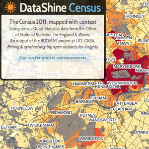
Second example, looking at the method of travel to work by bicycle, see how York, Oxford and Cambridge really stand out: https://datashine.org.uk/#table=QS7...Gn&layers=BTTT&zoom=8&lon=-0.9613&lat=52.9751
Third example, looking at households by deprivation dimensions in Sheffield, there is a really noticeable divide: https://datashine.org.uk/#table=QS1...n&layers=BTTT&zoom=13&lon=-1.4968&lat=53.3752
First example, looking at the method of travel to work by train, you can clearly see the increase around Garforth, East Garforth and Micklefield stations: https://datashine.org.uk/#table=QS7...d&layers=BTTT&zoom=14&lon=-1.3603&lat=53.7945The DataShine mapping platform is an output from an ESRC Future Research Leaders Project entitled “Big Open Data: Mining and Synthesis” (BODMAS). The overall project seeks promote and develop the use of large and open datasets amongst the social science community. A key part of this initiative is the visualisation of these data in new and informative ways to inspire new uses and generate insights. Phase one has been to create the mapping platform with data from the 2011 Census. ...
Second example, looking at the method of travel to work by bicycle, see how York, Oxford and Cambridge really stand out: https://datashine.org.uk/#table=QS7...Gn&layers=BTTT&zoom=8&lon=-0.9613&lat=52.9751
Third example, looking at households by deprivation dimensions in Sheffield, there is a really noticeable divide: https://datashine.org.uk/#table=QS1...n&layers=BTTT&zoom=13&lon=-1.4968&lat=53.3752


