py_megapixel
Established Member
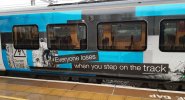
Honestly if you hadn't pointed it out I could have believed that that was a trick of the light. I'd say it's probably more subtle than the two different shades of blue on Northern...Has anyone else notice that 350/1s are a different shade to /3s and 4s?
I've seen a few like this and obviously whoever ordered the vinyl for the /1 refurb got the wrong colour.
Only subtle, but when together they stick out like a sore thumb. Left a proper LNWR colour on a /3 & Right a /1 with a more GWR type green than an LNWR shade.


 Is it me or do you think they would look better plain if they added just black window surrounds and that’s it? None of the big logos and garish colours?