• Our new ticketing site is now live! Using either this or the original site (both powered by TrainSplit) helps support the running of the forum with every ticket purchase! Find out more and ask any questions/give us feedback in this thread!

Best and worse bus liveries

Status
Not open for further replies.
Sponsor Post - registered members do not see these adverts; click here to register, or click here to log in
R

RailUK Forums

61653 HTAFC

Veteran Member
Joined
18 Dec 2012
Messages
19,372
Location
Yorkshire
I was never a fan of this monstrosity we were subjected to before First went all corporate...

8926665351_e7660554ee.jpg


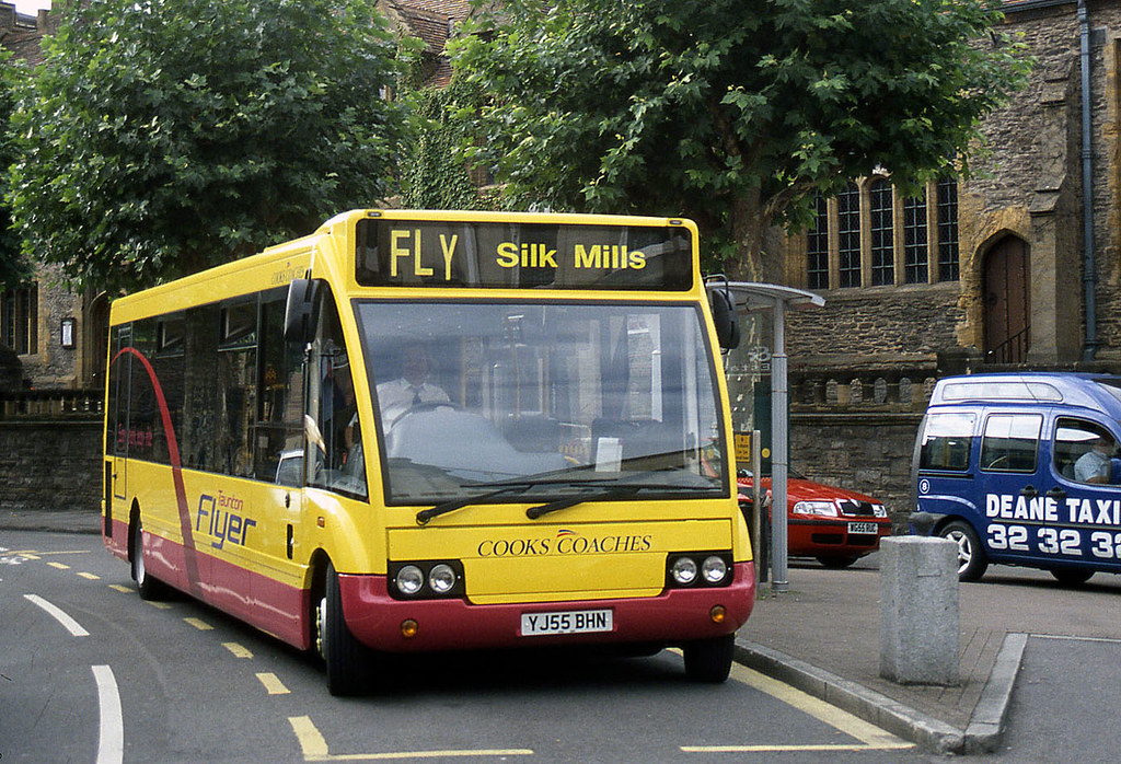
But I rather liked this one for Taunton's P&R when it first started...

5918895623_ac095a3353_b.jpg


And say what you like about Tracky, their deckers always looked the part. Simple but effective:

hwj932wa.jpg
 
Last edited:

90sWereBetter

Member
Joined
13 Nov 2012
Messages
1,046
Location
Lost somewhere within Bank-Monument tube station,
I've always liked Metroline's old red and blue livery. Very simple livery, but it stood out from the crowd in London, and looked very good indeed on just about everything they operated. In fact, I liked most of the 80% red liveries that were used, until TFL's ego ruined everything. <(

I'm just old enough to remember Grey-Green and Capital Citybus liveries in East London, which form some of my earliest bus-related memories. Great liveries. I also liked the local First liveries in my area.

The new Ipswich Buses livery is very, very gaudy. There was no reason to change from the tasteful white and green they were using beforehand. Probably the worst new livery in the country IMO.

But by far the worst bus livery has to be First's Barbie 2. Looked dreadful, and had the effect of making buses look several years older than they were. Add the fact that most of the bangers in the fleets got the livery, and that it killed off the local liveries just strengthens the argument.
 

43106

Member
Joined
6 Jul 2008
Messages
384
Location
South-ish Edinburgh
The best bus livery I've ever seen was the old Sheffield Corporation - white with rich blue stripes. Nothing has ever come close. I think Rochdale Corporation had a similar livery. Although it looked good, it must've been murder to keep it clean.
The worst is a toss-up between the NBC Leaf Green & Poppy Red debacle and the Lothian Red & Gold diamond 'livery', which was just something that creamed the jeans of Neil Renilson. It was (still is) hideous, but mercifully, they are being repainted into the old Madder & white livery.
 

Statto

Established Member
Joined
8 Feb 2011
Messages
4,104
Location
At home or at the pub
I've always liked Metroline's old red and blue livery. Very simple livery, but it stood out from the crowd in London, and looked very good indeed on just about everything they operated. In fact, I liked most of the 80% red liveries that were used, until TFL's ego ruined everything. <(

I'm just old enough to remember Grey-Green and Capital Citybus liveries in East London, which form some of my earliest bus-related memories. Great liveries. I also liked the local First liveries in my area.

The new Ipswich Buses livery is very, very gaudy. There was no reason to change from the tasteful white and green they were using beforehand. Probably the worst new livery in the country IMO.

But by far the worst bus livery has to be First's Barbie 2. Looked dreadful, and had the effect of making buses look several years older than they were. Add the fact that most of the bangers in the fleets got the livery, and that it killed off the local liveries just strengthens the argument.

Agreed, i liked the Grey-Green & Capital Citybus liveries, liked the First Capital Yellow/Red & the reverse Red/Yellow liveries.

Don't like the Arriva livery feel it's cold, which is a shame as most Arriva companies had great liveries before the corporate livery was forced upon them. I like Stagecoach swooshes livery.

Favourite livery is MPTE Green/Cream/Brown, NBC Green, & GM Buses White/Orange/Black livery.
 

Drsatan

Established Member
Joined
24 Aug 2009
Messages
1,887
Location
Land of the Sprinters
The best bus liveries I can think of are the following

1) Wilts & Dorset's old livery (dating from the early 90s). Although it looks fairly formal it's simple, clean and effective, and suits some buses very well, such as the Optare Spectra

2) Solent Blue Line's first livery (was common until 2005-2006). I liked the bright, cheerful nature of this livery which seemed to suit any bus.

3) Southern Vectis's old ivory and green livery. Simple and effective

Worst liveries I can think of

1) The 'Salisbury Reds' livery. To me it's simply overpowering

2) First's new livery. Just looks a mess
 

Ivo

Established Member
Joined
8 Jan 2010
Messages
7,307
Location
Bath (or Southend)
But by far the worst bus livery has to be First's Barbie 2. Looked dreadful, and had the effect of making buses look several years older than they were. Add the fact that most of the bangers in the fleets got the livery, and that it killed off the local liveries just strengthens the argument.

I always used to think that Barbie looked worse on vehicles that usually had Barbie 2 (back in the days when Barbie 2 was still a common sight). Now, no chance. Barbie 2 reall didn't work on anything, and whatever they were trying with the fade vinyl - if the intention was to make vehicles using it look old(er), they pass with flying colours.

I did like the look of Lynxes in Barbie 2 though.
 

Class 33

Established Member
Joined
14 Aug 2009
Messages
2,362
Best bus liveries in my opinion...

Bristol City Line's City Clipper livery on the Leyland Olympian's http://www.flickr.com/photos/861562...2aR-9oTauR-e1kUbP-aj6pUV-8dbhq4-b95gda-aZZs8B

And I do miss the days when there were green buses in Bristol(along with many other parts of the country) They should bring this livery back, even on all these not so interesting modern day buses!

http://www.flickr.com/photos/34487875@N07/3266326557/

http://www.flickr.com/photos/16737615@N04/5357957545/

http://www.flickr.com/photos/bristol-re/3835741965/

http://www.flickr.com/photos/fray_bentos/5893447996/
 
Last edited:

bristolian

Member
Joined
18 Aug 2005
Messages
9
Location
Huntingdon, Cambs, formerly from Bristol
Best bus liveries in my opinion...

Bristol City Line's City Clipper livery on the Leyland Olympian's http://www.flickr.com/photos/861562...2aR-9oTauR-e1kUbP-aj6pUV-8dbhq4-b95gda-aZZs8B

And I do miss the days when there were green buses in Bristol(along with many other parts of the country) They should bring this livery back, even on all these not so interesting modern day buses!

http://www.flickr.com/photos/34487875@N07/3266326557/

http://www.flickr.com/photos/16737615@N04/5357957545/

http://www.flickr.com/photos/bristol-re/3835741965/

http://www.flickr.com/photos/fray_bentos/5893447996/

The picture of WM1306 is one of mine :).
 
Joined
7 May 2013
Messages
90
My favourite has to be Stagecoach gold, this followed by Newport Bus. I like how it has been applied to the 400 double deckers. Then Stagecoach Red and White and last is Jones Of Aberbeeg. My least favourite is Country bus pre Peakes.

http://www.flickr.com/photos/48422263@N03/6351328962/
 

Attachments

  • DSC00605 - Copy.JPG
    DSC00605 - Copy.JPG
    146.1 KB · Views: 32
  • DSC00571 - Copy.JPG
    DSC00571 - Copy.JPG
    148.5 KB · Views: 32
  • DSC00601.JPG
    DSC00601.JPG
    134.1 KB · Views: 34
  • DSC00649.JPG
    DSC00649.JPG
    138.6 KB · Views: 23

TrainfanBen

Member
Joined
30 Oct 2010
Messages
193
Location
Coventry.
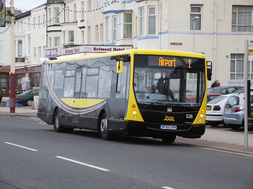
Worst undeniably IMO: (Blackpool Transport)
5000300363_90792b8fa2.jpg

I'm fond of De Courcey though, looking so smart and professional. Other than that I can't think of any.

EDIT:
What I find worse about Blackpool, is that their previous liveries under "Metrocoastlines" were perfectly adequate, the clarity for holidaymakers was great.
My question would be did they change their livery because it was too much like National Express?
I've always wondered what it'd be like if Blackpool transport became an NX operation.
 
Last edited:

martinsh

Established Member
Joined
27 Jan 2011
Messages
1,766
Location
Considering a move to Memphis
Worst undeniably IMO: (Blackpool Transport)
5000300363_90792b8fa2.jpg

I'm fond of De Courcey though, looking so smart and professional. Other than that I can't think of any.

EDIT:
What I find worse about Blackpool, is that their previous liveries under "Metrocoastlines" were perfectly adequate, the clarity for holidaymakers was great.
My question would be did they change their livery because it was too much like National Express?
I've always wondered what it'd be like if Blackpool transport became an NX operation.

Well I LIKE than livery and think it's bet than the old hotch-potch Metro Coastlines ones (but not as good as the old green / cream of course)
 

Ivo

Established Member
Joined
8 Jan 2010
Messages
7,307
Location
Bath (or Southend)
That black at the front just looks wrong. A bit like using what looks like a Centro on a tourist route.

Oh wait...
 

GazUk

Member
Joined
10 Dec 2012
Messages
81
Location
West Midlands
I get about to Leicester quite abit atm, and even though the arriva standard livery looks a bit bland, the new "sapphire Route" between the city and oadby town has a nice looking bus running on that route.

9162240798_36bea444ae_c.jpg


Also one company from that area that is worth a mention is Beaver Bus
Their livery isn't anything to shout about, but i always snigger when i see their slogan :D
5312157610_680e179ec8_z.jpg


Locally to me, travel De courcey have a pretty alright scheme.
 

Surreyman

Member
Joined
29 Jan 2012
Messages
1,020
Worst ever - Original First Corporate colours - Pink, Purple & battleship grey.

Best modern livery - Go Ahead London - Red with charcoal skirt and yellow lining.

Best traditional - London Country Green with yellow.
 

A0

On Moderation
Joined
19 Jan 2008
Messages
7,751
Worst in many ways was the NBC leaf green, particularly when the vehicles were allowed to get shabby. London Country was particularly bad in that regard, removing the white stripe and painting bumpers all black meant back in the 80s their Nationals looked really shabby and down-at heel when compared to neighbouring companies such as United Counties.

Immediately post privatisation there were some really nice liveries

- London Country NE's green and white looked good
- Luton & District's red and cream
- Eastern National green and yellow
- Cambus two tone blue and cream

Not so good was the 'LDT Shires' blue and yellow which looked wrong on some vehicles.

Generally, anything using black looks bad - it's a lousy colour to keep clean and shows up any panel 'imperfections' - and the examples given, such as Blackpool's current livery, really show that in my opinion.
 

Ivo

Established Member
Joined
8 Jan 2010
Messages
7,307
Location
Bath (or Southend)
The Sapphire bus looks really good. Is that even possible where Arriva are concerned? :lol:

Immediately post privatisation there were some really nice liveries

- Eastern National green and yellow

Now that was a nice livery :) And where I grew up, it was almost ezclusiverly seen on nicer vehicles such as Nationals and Lynxes too - although the yellow/green adopted for Darts later on did look quite good admittedly.
 

A0

On Moderation
Joined
19 Jan 2008
Messages
7,751
As for liveries that I think don't work...

Sampsons
(Red and blue: should never be seen together)
http://www.flickr.com/photos/johnmightycat/5729910676/

Sampson's livery was actually OK - the problem was the decrepit vehicles they used when combined with appalling service.

They very quickly lost their contracts (both LRT and HCC) owing to poor service. Not helped when VOSA (or whoever it was back then) also pulled a few of their vehicles off the road for various problems.
 

capital12

Member
Joined
20 Aug 2012
Messages
526
I get about to Leicester quite abit atm, and even though the arriva standard livery looks a bit bland, the new "sapphire Route" between the city and oadby town has a nice looking bus running on that route.

9162240798_36bea444ae_c.jpg


Also one company from that area that is worth a mention is Beaver Bus
Their livery isn't anything to shout about, but i always snigger when i see their slogan :D
5312157610_680e179ec8_z.jpg


Locally to me, travel De courcey have a pretty alright scheme.
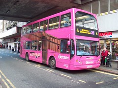
De Courcey livery is effectively Brighton & Hove (from who they purchased some second hand buses) with the colours changed slightly (and for the worse in my opinion!)
 

ReverendFozz

Member
Joined
26 Feb 2011
Messages
484
Location
Murton, Co. Durham
Some of the ones I like and dislike are

Worst

Go North East fromer 21 Angel
6432784705_6237ccffb7_m.jpg


Go North East 50 Whey Aye-50
5862511801_c82e9ba015_z.jpg


Go North East Fab Fifty Six
Huge image removed.

My favourite liveries are

Go North East Red Northern Livery
gne_8259.jpg


Go North East Poppy Livery
8496306276_3529627677_z.jpg


Photos are not mine, found them mostly on Flickr
 
Last edited by a moderator:
Status
Not open for further replies.

Top