It might be a new logo but it will be the same old when it comes to the service.

-
Our new ticketing site is now live! Using either this or the original site (both powered by TrainSplit) helps support the running of the forum with every ticket purchase! Find out more and ask any questions/give us feedback in this thread!
You are using an out of date browser. It may not display this or other websites correctly.
You should upgrade or use an alternative browser.
You should upgrade or use an alternative browser.
Arriva New Logo
- Thread starter Bwsbro
- Start date
- Status
- Not open for further replies.
Sponsor Post - registered members do not see these adverts; click here to register, or click here to log in
R
RailUK Forums
Teflon Lettuce
Established Member
- Joined
- 22 Aug 2013
- Messages
- 1,750
It might be a new logo but it will be the same old when it comes to the service.
reminds me of deckchairs on the Titanic....


BestWestern
Established Member
- Joined
- 6 Feb 2011
- Messages
- 6,736
Cluttered and completely unremarkable. Not a great effort.
Deepgreen
Established Member
Ghastly, contrived and childish.

185143
Established Member
- Joined
- 3 Mar 2013
- Messages
- 5,342
It's horrible. I wonder how much money they wasted on it?
They could have got a 3 year old to do better.

Busaholic
Veteran Member
- Joined
- 7 Jun 2014
- Messages
- 14,671
It's horrible. I wonder how much money they wasted on it?
A lot, guaranteed, probably to an outside design company for whom it's money for old rope.

I don't like it at all, there's nothing wrong with the current logo or the fleet standard "Interurban" livery.
If anything, I think Arriva should drop the "Max" brand, especially because all new buses in my area (presumably in all of Arriva's other divisions too) are pretty much "Max" specification anyway, and just have fleet standard and Sapphire. I never thought there was any point having the "Max" brand anyway, to be honest.
If anything, I think Arriva should drop the "Max" brand, especially because all new buses in my area (presumably in all of Arriva's other divisions too) are pretty much "Max" specification anyway, and just have fleet standard and Sapphire. I never thought there was any point having the "Max" brand anyway, to be honest.
Busaholic
Veteran Member
- Joined
- 7 Jun 2014
- Messages
- 14,671
I don't like it at all, there's nothing wrong with the current logo or the fleet standard "Interurban" livery.
If anything, I think Arriva should drop the "Max" brand, especially because all new buses in my area (presumably in all of Arriva's other divisions too) are pretty much "Max" specification anyway, and just have fleet standard and Sapphire. I never thought there was any point having the "Max" brand anyway, to be honest.
As soon as you have ''Max'' it begs the question- are their other operations ''Min''?
Bletchleyite
Veteran Member
As soon as you have ''Max'' it begs the question- are their other operations ''Min''?
Sapphire and the likes do that as well. Given that the premium interiors aren't actually high-cost (they tend to just include different coloured lighting/panels and faux-leather seats which are a budget conscious choice anyway as they are cheap to clean), you could argue that they should be applied to the whole fleet on a rolling basis.
Though I must admit I'm not a fan of the Sapphire interior, particular the chavvy blue lighting. Not classy at all. Max, which is not dissimilar but using more conventional schemes, is much more to my taste.
Last edited:
It seems madness if Arriva do intend to update the logo.
The logo and word logo have remained quite fresh and classic from a design point of view. However the present 'interurban' livery does not work on vehicles such as the Solo SR, Versa or any other bodywork with black work above the window line as it disrupts the 'cow horns' I'm not a fan of either turquoise or aquamarine!
Interesting that other Arriva territories have kept the original livery.
I recall reading an interesting article in which Ray Stenning recalls presenting the Arriva brand and livery to the then Cowie Group and an argument broke out between Stenning and the MD over the height of the cream stripe on the original livery....
The logo and word logo have remained quite fresh and classic from a design point of view. However the present 'interurban' livery does not work on vehicles such as the Solo SR, Versa or any other bodywork with black work above the window line as it disrupts the 'cow horns' I'm not a fan of either turquoise or aquamarine!
Interesting that other Arriva territories have kept the original livery.
I recall reading an interesting article in which Ray Stenning recalls presenting the Arriva brand and livery to the then Cowie Group and an argument broke out between Stenning and the MD over the height of the cream stripe on the original livery....

If anything, I think Arriva should drop the "Max" brand, especially because all new buses in my area (presumably in all of Arriva's other divisions too) are pretty much "Max" specification anyway, and just have fleet standard and Sapphire. I never thought there was any point having the "Max" brand anyway, to be honest.
Do remember that Arriva are competing against other bus operators rather than just themselves.
Do remember that Arriva are competing against other bus operators rather than just themselves.
I do know that, but what I said in my original comment is I no longer see the point in having the "Max" brand if all of Arriva's new buses are pretty much the exact same specification as "Max".
In my view, it would be better to just have the standard specification and "Sapphire", and upgrade current "Max" routes to "Sapphire".
southernyoshi
Member
- Joined
- 12 Sep 2014
- Messages
- 164
When is this being introduced fully? Is it coming with the normal April timetable changes around the country?
Bletchleyite
Veteran Member
Dunno, but I notice they've redone their (really rather good) bus app into the new colour scheme but with the old logo for now.
When is this being introduced fully? Is it coming with the normal April timetable changes around the country?
What "April timetable changes around the country"??
southernyoshi
Member
- Joined
- 12 Sep 2014
- Messages
- 164
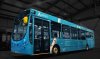
It was sort of a loose comment - it always seems like pretty much every operator has some form of service changes around spring. I saw te other day that Arriva are doing pretty big network changes in Kent in April, I wonder if that'll be a chance to introduce the new look. Has the livery leaked yet?

Bletchleyite
Veteran Member
The logo is horrid, but the livery isn't bad.
Here we go...
That isn't quite as bad as I thought it could have been
I think that the shade of blue makes the company look dated. Just as I am no fan of the pastel green shades on Southern train interiors.
I'd have considered a darker blue personally, and then even the old logo could have sufficed.
There will be good brand recognition from the colour I suppose, so maybe this was intention, or maybe someone really likes pastel shades.
I'd have considered a darker blue personally, and then even the old logo could have sufficed.
There will be good brand recognition from the colour I suppose, so maybe this was intention, or maybe someone really likes pastel shades.
Teflon Lettuce
Established Member
- Joined
- 22 Aug 2013
- Messages
- 1,750
at least the new livery doesn't look like a tube of a certain make of hemorrhoid cream!
Bletchleyite
Veteran Member
It's quite fresh and welcoming but a little cold though. The present livery is worn out
Is it? I like the "express" one - I'd agree the old turquoise-and-vomit is a little worn, but the newer darker one works for me.
Though as I said the livery isn't a bad job.
and Arriva do need an image makeover
They do indeed, but that makeover is not about a new logo, but is about quality and consistency, which they are terrible at. They need some lessons from Stagecoach about presentation.
Last edited:
Is it? I like the "express" one - I'd agree the old turquoise-and-vomit is a little worn, but the newer darker one works for me.
Though as I said the livery isn't a bad job.
They do indeed, but that makeover is not about a new logo, but is about quality and consistency, which they are terrible at. They need some lessons from Stagecoach about presentation.
Actually I'd agree with that. Now that Reading has the MAXX branded Mercs for the High Wycombe to Reading Service, I actually rather like the darker more luxurious version of the livery.
Of course consistency isn't Arriva's thing - those very smart Mercs, despite being repainted and refurbished for their new life with Arriva Shires, still retain many of their NWM Stickers on the windows from their Walsall based days.
Bletchleyite
Veteran Member
Of course consistency isn't Arriva's thing - those very smart Mercs, despite being repainted and refurbished for their new life with Arriva Shires, still retain many of their NWM Stickers on the windows from their Walsall based days.
It isn't their thing anywhere. Another example - on ATW, on the late Mach-Pwllheli train, they can never be bothered to set up the PIS, nor to place reservations.
OK, it carries one man and his dog and the guard can tell you what the next stop is - but it's a sign of a sloppy corporate culture and it is very noticeable.
Is this a Best Impressions job without Ray designing the logo?
At least Arrivia have not gone to the ladies at Buzz.
www.busandcoachbuyer.com/creating-buzz/ gosh they have no idea....
At least Arrivia have not gone to the ladies at Buzz.
www.busandcoachbuyer.com/creating-buzz/ gosh they have no idea....
Bletchleyite
Veteran Member
At least Arrivia have not gone to the ladies at Buzz.
www.busandcoachbuyer.com/creating-buzz/ gosh they have no idea....
Do you reckon? Their approach is different to Stenning's, but personally I think Stenning's style is getting rather samey at times. To me it still makes everything look like Trent Barton - his default style is almost typecast.
- Status
- Not open for further replies.