The exit signs by the exits are green.
The exit signs by the exits being green isn't really an adequate answer to the rest of the platform where many will be alighting without necessarily knowing how to change platform or exit as needed. A good wayfinding system should clearly inform and aid end-users start to finish regardless of where their origin and destination is. This does not do that very well. The exit signage away from the exit itself is just signposted as "Exit" with a corresponding arrow on the same backdrop as all other signage is. This can get very confusing, especially due to the lack of contrast when assessed from the side (example image below):

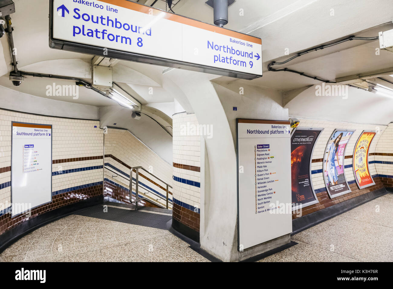
Is that any better? Genuine question. There are countless examples in London where the lines are labelled as southbound and northbound when they are not, or labelled eastbound and westbound when they are not. Is that more or less confusing? If you're going from Kings Cross to Finsbury Park on the Piccadilly Line you take an eastbound train but on the Victoria Line you take a northbound train. Both go in the same direction. I used to live near Shiremoor. Is that north or east? What about the airport, is that north or west? Because of the geography of the area, with the Tyne generally flowing north-east, South Shields is actually quite a bit further north than Monument. How pedantic are we being?
Quite frankly, I don't know if it is significantly better but I'd say people generally understand that trains towards the coast
from Monument itself are east, towards Sunderland and South Shields is south, towards Airport is North and St James itself West. But the way things are now specifically at Monument is generally confusing in my opinion. To answer your question about pedantry, I was specifically just describing Monument itself, not the wayfinding of the entire network although I am sure there are areas network-wide where wayfinding changes could be applicable. A sidenote about London is that the compass direction trains are generally signposted with a map in that corresponding direction. This does happen at Monument, including on the platforms, but I still think there's a need to clarify it where possible particularly on the top of the wall. That is one reason this system works
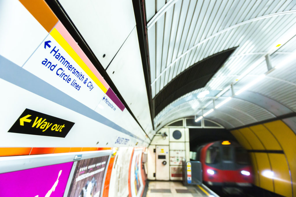
reasonably well in London. The Circle Line might be a better reference but I can't comment there as I have not used it or looked at its design. Example images below:
I would like to note here that there is a clear contrast in the above image when the London Underground refers to the "Way out" (in black and yellow) and then the respective line colours above, surely this logic could work on the Metro to help these different elements stand out and become more recognisable network-wide?
I don't and didn't see many people standing around at Monument looking confused, to be honest, although it is the thick end of a decade since I left Newcastle. The main confusion always seemed to be with those heading towards the coast and not knowing whether they needed to go via South Gosforth or via Wallsend, with the bonus of the old trains having the destination showing as 'St James via The Coast' at Monument when heading via South Gosforth. I'm not sure that changing the signage to northbound and eastbound would make that any clearer- the whole of the Coast Circle is both north and east of Monument.
It is not the
only probable solution but it is one such example I offered which I agree has reasonable flaws if you applied it to the entire network and on the fleet which I wasn't suggesting. In general my criticism stands that it could be more clear; as user bramling highlighted
"There’s definitely a lot of scope for non-locals not to understand things, especially with the way St James services call at Monument twice.". I do believe there has to be a better way. I do sometimes have people walking up to me on platforms and sometimes on trains asking me questions such as "
Does this train go to Wallsend?",
"How do I get to Platform 1?",
"Am I on the right platform to go to Byker?". It isn't a daily occurrence by any means but I'd say it happens once every 1-2 months as a regular Metro user traveling through the core. It indicates people do sometimes struggle to navigate the station and the mapping using the station signage. I do agree on your later comment, however, that a concourse PID would be major, although for many it probably wouldn't dictate what direction around the network they'll take unless they live directly in the middle of the loop from Monument, around the West Monkseaton area?
But if you're assessing the way old trains looked at the information, arguably the new trains could be improved in small ways too. Why can't the PID in the front display the Train Running Number (TRN) anymore for reporting issues to Nexus with a reference of what train you are travelling on like the old fleet did (or perhaps on its internal LCDs too)? Why doesn't the PID screen flick between, say, "South Hylton" -> "Green Line" -> "South Hylton" in a loop to indicate the line colour? Or as the old fleet did, "via The Coast" or "via Whitley Bay".
There are probably a lot of examples of stations on the network where the signage is inadequate or confusing. But I realise we're a bit off-topic from the thread's topic