CR165022
Established Member
The 68s very regularly run the wrong way round on sets, both with the MK3s and now the MK5s too.That means that the Class 68 must always run with the red flash in the opposite direction in order to match

The 68s very regularly run the wrong way round on sets, both with the MK3s and now the MK5s too.That means that the Class 68 must always run with the red flash in the opposite direction in order to match

I must agree - what a mess!The livery looks very smart but this reinforces my view that the red flag decal shouldn't be on intermediate carriages. Too busy. End vehicles only would be better.

This validates, at least to me, that this either has been considered but wasn’t taken seriously or, the more likely option, no-one with serious knowledge of the stock was consulted.The 68s very regularly run the wrong way round on sets, both with the MK3s and now the MK5s too.

If I recall correctly it was, in effect, a directive from the Salmond-era SNP Government, at the time where the media were still referring to it as an "Executive".It has been done much, much more tastefully than this.


There’s a specially dedicated thread for people’s thoughts and tweaks hereI like the big GBR on the side of the loco, that looks quite cool. The livery is ok, just needs tweaks especially to intermediate carriages. Personally i'd make the upwards red bit (if you must have it) a vertical block. it would be more in keeping with the Union Flag in any event.
 www.railforums.co.uk


At last, the most GBR-able livery is getting (at least partially) GBR-ised.Still images from the link above
Southeastern instagram


Still images from the link above
Southeastern instagram
View attachment 211602View attachment 211603View attachment 211604

They need to bring back the Jaffa Cake livery and the 1066 Electrics!Still images from the link above
Southeastern instagram
View attachment 211602View attachment 211603View attachment 211604
Maybe this wasn't far off after all.Temporary rollout coming soon.....
The Scotrail livery and overall brand was designed by Redpath, a design and brand agency, in line with a brief from Transport Scotland. It's why it looks smart and professional rather than an incoherent, brash mess "designed" by a child.If I recall correctly it was, in effect, a directive from the Salmond-era SNP Government, at the time where the media were still referring to it as an "Executive".
Alex Salmond always preferred cleaner, more subtle displays of Scottish nationalism - in part deliberately to contrast with what usually comes out of UK/GB nationalism. It's similar to the reason why the Scottish Government logo is so simple - to contrast with the UK Government being very complex and hard to decipher royal coats of arms, it was meant to be simple and the "message" easily understood.
I can't recall to what extent he was personally involved in the ScotRail livery proposals, but I'm sure he was satisfied with the outcome. It is subtle but still obvious nationalism, designed in part to contrast with England rather than try to derive something from that.

should be a part of a rollout across all DFTO operators.Looks good. I wondered why they did not put the double arrow and GBR on the class 357s for c2c. Seems enough space on the electrostar cabs.
Is this just one unit for southern or start of wider rollout?

The Scotrail livery and overall brand was designed by Redpath, a design and brand agency, in line with a brief from Transport Scotland. It's why it looks smart and professional rather than an incoherent, brash mess "designed" by a child.
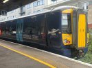
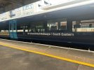
375822 has gained Great British Railways | South Eastern branding.
Unless GBR is planning a major increase in cross-border services it'll look pretty much like it does now, with ScotRail livery dominating.Honestly I'm looking forward to seeing how a busy Glasgow Central will look with a mix of fully-GBR'd Pendos, 397s and Voyagers amongst Scotrail everything else. That'll be the true comparison.
It’s part of a wider rollout of the new operator/sector names, they’re not going to re-do every single train into the full livery to start with, it’d take ages to get the names out there.Is this the best they could do?
It's already in what is basically the base GBR livery!
Yes, it makes perfect sense. What would be far more confusing is retaining the existing TOC logos until trains are repainted. I assume website and app logos will change soon as well.It’s part of a wider rollout of the new operator/sector names, they’re not going to re-do every single train into the full livery to start with, it’d take ages to get the names out there.
Unless GBR is planning a major increase in cross-border services it'll look pretty much like it does now, with ScotRail livery dominating.

Far prefer this to everything else. Perhaps a dash of red and white lines at either end could be nice (ScotRail strikes again) but overall this is actually the closest we've gotten to a good design - simplicity is key here, ironically!375822 has gained Great British Railways | South Eastern branding.
The GBR Anglia website is a mess. what are they actually called? It's still Greater Anglia branded, but everything else refers to GBR Anglia.Yes, it makes perfect sense. What would be far more confusing is retaining the existing TOC logos until trains are repainted. I assume website and app logos will change soon as well.
Just mirrors the trains which have three different names on them.The GBR Anglia website is a mess. what are they actually called? It's still Greater Anglia branded, but everything else refers to GBR Anglia.
It’s not a GBR design though… just the Southeastern livery with a new logo slapped onFar prefer this to everything else. Perhaps a dash of red and white lines at either end could be nice (ScotRail strikes again) but overall this is actually the closest we've gotten to a good design - simplicity is key here, ironically!
The blue is very similar to the 'actual' GBR deep blue though.It’s not a GBR design though… just the Southeastern livery with a new logo slapped on