
-
Our new ticketing site is now live! Using either this or the original site (both powered by TrainSplit) helps support the running of the forum with every ticket purchase! Find out more and ask any questions/give us feedback in this thread!
You are using an out of date browser. It may not display this or other websites correctly.
You should upgrade or use an alternative browser.
You should upgrade or use an alternative browser.
Stations rebranded to Great British Railways design / Rail Alphabet 2 & 3
- Thread starter JaJaWa
- Start date
Sponsor Post - registered members do not see these adverts; click here to register, or click here to log in
R
RailUK Forums

Off the top of my head, Apple's flat design language was quite iterative over updates. Seems to be the same with their new Liquid Glass design language, which has seen refinements and iteration this year. It is somewhat unusual to do so much iteration after launch, but I suppose for something like this it makes sense, and is probably a good sign (haha!) that the people working on it are making improvements based on research and feedback, which is a good thing.Curious -- the use of iterative designs to perfect RA2 over many years seems an inefficient way to do it. In previous large-scale rebrands, has anything similar been seen? Or is this just pure incapability?

birchesgreen
Established Member
Its not that unusual, many design concepts which seem fine in development fall apart when they hit the real world and require some tweaking.Curious -- the use of iterative designs to perfect RA2 over many years seems an inefficient way to do it. In previous large-scale rebrands, has anything similar been seen? Or is this just pure incapability?

If these things didn't make money then you'd not see them so often. Advertising whether we like it or not clearly works. Whilst the sign might not make you think "I need to buy that now" it does mean that companies name is in your head.There's a third thing it can do. Nothing.
Goldfish62
Veteran Member
- Joined
- 14 Feb 2010
- Messages
- 13,238
There's plenty of space on stations for advertising without doing so on station signage. What next? Advertising on road signs?If these things didn't make money then you'd not see them so often. Advertising whether we like it or not clearly works. Whilst the sign might not make you think "I need to buy that now" it does mean that companies name is in your head.
It all crosses a line for me. Signage is there for important information and nothing else.
Advertising on station signs has been done for years though. Guildford for example has had University of Surrey signs for at least ten yearsThere's plenty of space on stations for advertising without doing so on station signage. What next? Advertising on road signs?
It all crosses a line for me. Signage is there for important information and nothing else.

Steddenm
Established Member
There have been pseudo adverts for KitKat on the motorways for years when the DMI shows "Take a break"What next? Advertising on road signs?

nlogax
Established Member
It goes further back to NSE days, certainly I recall Basingstoke being sponsored by Winterthur Life back at the start of the 1990s.Advertising on station signs has been done for years though. Guildford for example has had University of Surrey signs for at least ten years
You could argue it already happens on road signs. Service stations advertise the brands that are there...There's plenty of space on stations for advertising without doing so on station signage. What next? Advertising on road signs?
It all crosses a line for me. Signage is there for important information and nothing else.
Goldfish62
Veteran Member
- Joined
- 14 Feb 2010
- Messages
- 13,238
You do realise I mean DfT-approved statutory road signage as included in the Highway Code? No, obviously not.You could argue it already happens on road signs. Service stations advertise the brands that are there...
py_megapixel
Established Member
You do realise DfT-approved statutory road signs with motorway service station brands exist and are listed in the highway code? No, obviously not...You do realise I mean DfT-approved statutory road signage as included in the Highway Code? No, obviously not.

(From https://www.gov.uk/guidance/the-highway-code/traffic-signs)

rmHawk765
Member
The exterior branding including the double arrows at my local GTR station has been removed, will keep an eye on what they put there.

Rick1984
Member
- Joined
- 23 Aug 2012
- Messages
- 1,150
Is not so you can avoid them? As in "That's a Road Chef. I'm not stopping there"You could argue it already happens on road signs. Service stations advertise the brands that are there...
Or the opposite

Imagine having to walk a mile each way down the hard shoulder every day just to update that petrol priceYou do realise DfT-approved statutory road signs with motorway service station brands exist and are listed in the highway code? No, obviously not...
View attachment 207008
(From https://www.gov.uk/guidance/the-highway-code/traffic-signs)

This changed in 2011 - http://news.bbc.co.uk/1/hi/uk_politics/4429462.stm - although was proposed in 2005.You do realise I mean DfT-approved statutory road signage as included in the Highway Code? No, obviously not.
Some new RA2 in Paddington. Looks rather snazzy and feels like we're starting to return to a clear and coherent identity that other national operators have eg. DSB, NS
Ignoring all the Brunel that's still predominant...
Ignoring all the Brunel that's still predominant...
Attachments
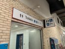
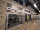

Paddington was meant to be the first station done to coincide with the Elizabeth line opening as it had to be added to the signs. But never happened & LIZ was added to the old signs.Some new RA2 in Paddington. Looks rather snazzy and feels like we're starting to return to a clear and coherent identity that other national operators have eg. DSB, NS
Ignoring all the Brunel that's still predominant...
Maybe it will be the first station to be done properly.
(Source: linked from post 1 in this thread in 2020!)
Some new RA2 in Paddington. Looks rather snazzy and feels like we're starting to return to a clear and coherent identity that other national operators have eg. DSB, NS
Ignoring all the Brunel that's still predominant...
The issue is it’s the already superseded guidance and RA2.
Anyone sighted the updated guidance with RA3 yet that has been used for Cambridge South?
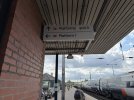
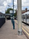
Wigan North Western has just had RA2 signs added pointing to the… non-existent Platform 2
Source: https://x.com/Martin_H_1986/status/2082776172622958708
Source: https://x.com/Martin_H_1986/status/2082776172622958708
Attachments

brick60000
Member
- Joined
- 18 Apr 2013
- Messages
- 463
I still feel it pales in comparison to the likes achieved by Switzerland, Austria, etc. They seem to really just get wayfinding signage. We could absolutely learn a thing or two from their approach.Some new RA2 in Paddington. Looks rather snazzy and feels like we're starting to return to a clear and coherent identity that other national operators have eg. DSB, NS
Ignoring all the Brunel that's still predominant...
This feels too much like something thrown together to get a consistent look on the cheap, than something actually properly & fully thought through, and tested - as demonstrated by the constant variation in application. White background, black text, will not age well I fear. The black background/white text example at New Street is a perfect example of how a splash of base colour instantly makes something look more premium, imo.
I don’t really understand why this is still rolling out ahead of GBR actually being established, and deciding exactly what they want their overarching identity to be. That would then allow the necessary nationwide body to govern the rollout in full, rather than each TOC having their own slightly different variations.
The issue is it’s the already superseded guidance and RA2.
Anyone sighted the updated guidance with RA3 yet that has been used for Cambridge South?
The variation in application is a complete mess. How can it be so hard to get it right!!

Transilien
Member
But that would be no fun!!I don’t really understand why this is still rolling out ahead of GBR actually being established, and deciding exactly what they want their overarching identity to be. That would then allow the necessary nationwide body to govern the rollout in full, rather than each TOC having their own slightly different variations.

Completely agree, it all looks rubbish and is not as user friendly as it should be.I still feel it pales in comparison to the likes achieved by Switzerland, Austria, etc. They seem to really just get wayfinding signage. We could absolutely learn a thing or two from their approach.
This feels too much like something thrown together to get a consistent look on the cheap, than something actually properly & fully thought through, and tested - as demonstrated by the constant variation in application. White background, black text, will not age well I fear. The black background/white text example at New Street is a perfect example of how a splash of base colour instantly makes something look more premium, imo.
I don’t really understand why this is still rolling out ahead of GBR actually being established, and deciding exactly what they want their overarching identity to be. That would then allow the necessary nationwide body to govern the rollout in full, rather than each TOC having their own slightly different variations.
The variation in application is a complete mess. How can it be so hard to get it right!!
It’s a sign of things to come. Cheap, ill thought out and badly implemented.
It does give us something else to moan about I suppose, which is something we are actually very good atBut that would be no fun!!
Transilien
Member
Yeah, the utter incompetence of the uk rail industry makes this forum more interesting!It does give us something else to moan about I suppose, which is something we are actually very good at
KatieLouLou
Member
- Joined
- 20 Oct 2014
- Messages
- 59
Hertford North has acquired RA2/RA3 signage in conjunction with the new lift - but only the ones that are new or needed changing as a result, so looks a bit of a mess - the rest is still FCC style, with the odd bit of GN thrown in.
LLivery
Established Member
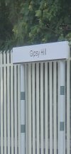
Randomly Gipsy Hill station in South London seems to have been now done. I believe this was the first station to gain Connex Livery, back in the day.
I finally travelled through GH. I had hoped they'd be installing signs that look better than this. Apologies for not the best of quality.
Attachments
Transilien
Member
What’s the bottom bar supposed to represent? Is it green for southern? Or black because the ‘designers’ were drunk that day? I thought they had decided on red for the bottom bar!I finally travelled through GH. I had hoped they'd be installing signs that look better than this. Apologies for not the best of quality.

Who thought that looked any better than what it replaced? Poor font and acres of empty white spaceI finally travelled through GH. I had hoped they'd be installing signs that look better than this. Apologies for not the best of quality.
What absolute garbage!
LLivery
Established Member
Who thought that looked any better than what it replaced? Poor font and acres of empty white space
What absolute garbage!
Well, exactly.
What’s the bottom bar supposed to represent? Is it green for southern? Or black because the ‘designers’ were drunk that day? I thought they had decided on red for the bottom bar!
It looked black to me, but it might be very dark green.
It's all such a disappointment. A simple red and white brand like the signs done properly could've looked very classy.
What colour was the old sign - was the new vinyl simply cut too short and it's unintentional?What’s the bottom bar supposed to represent? Is it green for southern? Or black because the ‘designers’ were drunk that day? I thought they had decided on red for the bottom bar!