
I agree, it was largely an experiment, and I think the issue is the use of too many colours at once. I think one shade of red, white and blue would work better. The best TOC liveries used two to three colours at most (eg. Virgin, GNER) with any fourth one being for accenting such as Stagecoach-based liveries. To be honest I just don't think the Union Flag lends itself to a livery as much as the Scotrail Saltire does, so the better use of the colours would be on a Virgin, GNER, Stagecoach or Northern Rail 333 style pattern in my opinion.That doesn't look as good as I expected! Though the patterns on the intermediates may be better than the directional one.

-
Our new ticketing site is now live! Using either this or the original site (both powered by TrainSplit) helps support the running of the forum with every ticket purchase! Find out more and ask any questions/give us feedback in this thread!
You are using an out of date browser. It may not display this or other websites correctly.
You should upgrade or use an alternative browser.
You should upgrade or use an alternative browser.
Great British Railways livery: Alternative suggestions/variations
- Thread starter Rab Smith
- Start date
Sponsor Post - registered members do not see these adverts; click here to register, or click here to log in
R
RailUK Forums

Leyland Bus
Member
It would have been so much simpler and probably so much better had they simply instructed Best Impressions.
"Other design studios are available"


omnicity4659
Member
- Joined
- 25 Sep 2017
- Messages
- 233
Spotted some updated GBR posters (that are less 'flaggy') and liked the (perhaps unintentional) subtle nod to the Provincial livery, so thought I would replicate and modify it onto a unit...


I like the look of thatSpotted some updated GBR posters (that are less 'flaggy') and liked the (perhaps unintentional) subtle nod to the Provincial livery, so thought I would replicate and modify it onto a unit...
View attachment 205144
Stossgebet
Member
Lovely to see a BR era unit, in a proposed GBR livery.Spotted some updated GBR posters (that are less 'flaggy') and liked the (perhaps unintentional) subtle nod to the Provincial livery, so thought I would replicate and modify it onto a unit...
View attachment 205144
Leyland Bus
Member
Love that!! It's perfect! Far better looking IMO but still keeps the elements the Govt. are wanting.Spotted some updated GBR posters (that are less 'flaggy') and liked the (perhaps unintentional) subtle nod to the Provincial livery, so thought I would replicate and modify it onto a unit...
View attachment 205144
Do you have a photo of the poster you saw by chance?

This is really greatSpotted some updated GBR posters (that are less 'flaggy') and liked the (perhaps unintentional) subtle nod to the Provincial livery, so thought I would replicate and modify it onto a unit...
View attachment 205144
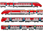
I think the livery should have focused more on the rail red and the double arrow logo that defined British Rail. I decided to come up with a livery based on that, while also trying to make it easier for the depot people to maintain. I will try to text-describe the image.
The livery is predominantly red, with a white roof and lower half, and blue passenger doors (in line with page 49 of the wayfinding guidelines, located at https://www.networkrail.co.uk/wp-content/uploads/2022/11/Wayfinding.pdf). The double arrow at front is white on a red background, without the "GBR" text.
The service logo is at the lower centre of the carriage on a white background, consisting of a red double arrow, and the region or service in black text. Provision is also made for the train name at the lower front, such as "Arterio" or "Azuma", either in plain white text on red background, or plain red text on a white background. Black on white was selected over blue on white, to reflect the wayfinding guidelines and for maximum contrast.
First class is indicated with a yellow upper band and quiet coaches have a sky blue upper band. On Intercity trains, the number 1 indicates first class, and the letter Q indicates a quiet coach.
Credits are as follows:
The image is licensed under CC-BY-SA 4.0.
The livery is predominantly red, with a white roof and lower half, and blue passenger doors (in line with page 49 of the wayfinding guidelines, located at https://www.networkrail.co.uk/wp-content/uploads/2022/11/Wayfinding.pdf). The double arrow at front is white on a red background, without the "GBR" text.
The service logo is at the lower centre of the carriage on a white background, consisting of a red double arrow, and the region or service in black text. Provision is also made for the train name at the lower front, such as "Arterio" or "Azuma", either in plain white text on red background, or plain red text on a white background. Black on white was selected over blue on white, to reflect the wayfinding guidelines and for maximum contrast.
First class is indicated with a yellow upper band and quiet coaches have a sky blue upper band. On Intercity trains, the number 1 indicates first class, and the letter Q indicates a quiet coach.
Credits are as follows:
- WestRail642fan of Wikimedia Commons for the Class 377 diagram, located at https://commons.wikimedia.org/wiki/File:Southern_Class_377-3.png (CC-BY-SA 4.0)
- WestRail642fan of Wikimedia Commons for the Class 701 diagram, located at https://commons.wikimedia.org/wiki/File:SWR_Class_701-5.png (CC-BY-SA 4.0)
- WestRail642fan of Wikimedia Commons for the Class 800 diagram, located at https://commons.wikimedia.org/wiki/File:GWR_Class_800-0.png (CC-BY-SA 4.0)
The image is licensed under CC-BY-SA 4.0.
Attachments
Bit late to the party but this is a good one. Incorporates the red, white and blue subtly enough that it's not obnoxious and can be applied to a lot of rolling stock with minimal modifications.Spotted some updated GBR posters (that are less 'flaggy') and liked the (perhaps unintentional) subtle nod to the Provincial livery, so thought I would replicate and modify it onto a unit...
View attachment 205144
These aren't bad designs by any stretch, but I disagree with the principle of leaning into colours that defined British Rail when the point of GBR should not just be British Rail 2.0, which is also why I am also against people suggesting bringing back old InterCity, Network SouthEast and Regional Railways liveries.I think the livery should have focused more on the rail red and the double arrow logo that defined British Rail. I decided to come up with a livery based on that, while also trying to make it easier for the depot people to maintain. I will try to text-describe the image.
The livery is predominantly red, with a white roof and lower half, and blue passenger doors (in line with page 49 of the wayfinding guidelines, located at https://www.networkrail.co.uk/wp-content/uploads/2022/11/Wayfinding.pdf). The double arrow at front is white on a red background, without the "GBR" text.
The service logo is at the lower centre of the carriage on a white background, consisting of a red double arrow, and the region or service in black text. Provision is also made for the train name at the lower front, such as "Arterio" or "Azuma", either in plain white text on red background, or plain red text on a white background. Black on white was selected over blue on white, to reflect the wayfinding guidelines and for maximum contrast.
First class is indicated with a yellow upper band and quiet coaches have a sky blue upper band. On Intercity trains, the number 1 indicates first class, and the letter Q indicates a quiet coach.
Credits are as follows:
- WestRail642fan of Wikimedia Commons for the Class 377 diagram, located at https://commons.wikimedia.org/wiki/File:Southern_Class_377-3.png (CC-BY-SA 4.0)
- WestRail642fan of Wikimedia Commons for the Class 701 diagram, located at https://commons.wikimedia.org/wiki/File:SWR_Class_701-5.png (CC-BY-SA 4.0)
- WestRail642fan of Wikimedia Commons for the Class 800 diagram, located at https://commons.wikimedia.org/wiki/File:GWR_Class_800-0.png (CC-BY-SA 4.0)
The image is licensed under CC-BY-SA 4.0.
Although I am critical of how they churn out the same liveries to different bus companies over and over again, in this case I’d be in favour of giving Best Impressions the job. They’d design something that works across all touch points, whether that is the trains, the signage or any printed materials.It would have been so much simpler and probably so much better had they simply instructed Best Impressions.
978wta
Member
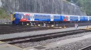
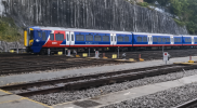
My effort, I don’t have any fancy programs so had to try with ChatGPT.
I like the front half of the body side on the GBR livery but I don’t like how it’s repeated along every carriage, so I tried to adopt an NSE style lower body stripe.
I like the front half of the body side on the GBR livery but I don’t like how it’s repeated along every carriage, so I tried to adopt an NSE style lower body stripe.
Attachments

My effort, I don’t have any fancy programs so had to try with ChatGPT.
I like the front half of the body side on the GBR livery but I don’t like how it’s repeated along every carriage, so I tried to adopt an NSE style lower body stripe.
That's actually not bad!
Bletchleyite
Veteran Member
That's actually not bad!
Agreed, that works quite well.
That's pretty good actually. It's a lot neater and lends itself better to a train compared to the current livery. Not sure how it would look on some more streamlined intercity models but it's not like the actual colour scheme has that going for it either. This one at the very least would still work.My effort, I don’t have any fancy programs so had to try with ChatGPT.
I like the front half of the body side on the GBR livery but I don’t like how it’s repeated along every carriage, so I tried to adopt an NSE style lower body stripe.
Leyland Bus
Member
Another one for the like pile! Works really well. You should submit it to the DfT!
Agreed, that works quite well.
Looks like it would also work quite well on various different stock types, which I'm not sure the official livery will.

Peter Mugridge
Veteran Member
A vast improvement.My effort, I don’t have any fancy programs so had to try with ChatGPT.
I like the front half of the body side on the GBR livery but I don’t like how it’s repeated along every carriage, so I tried to adopt an NSE style lower body stripe.

( Why don't we have a thumbs up symbol in the smileys list??? )

Callum450
Member
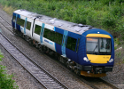
I’m aware that we should probably move away from older BR sectors but as for a bit of fun I’ve created a modernised brand identity for Regional Railways.
One of the biggest inspirations for the livery is the Kuwait Airways livery which (in my opinion) looks very sleek and modern and the fading dot stipple patten design is meant to resemble Northern’s current seat moquette.
Those with eagle eyes may notice the logo is extremely similar (well pretty much the same ) to the past SWT/EMT logos. I’ve gone with this style because I think Futura is a very clean font and there is a major emphasis on the ‘Regional’ aspect of the logo. I’ve also replaced the hole in the ‘O’ with the double arrows because I think it looks cool, that’s it.
Any thoughts?
(Original photo by Martin Loader)
One of the biggest inspirations for the livery is the Kuwait Airways livery which (in my opinion) looks very sleek and modern and the fading dot stipple patten design is meant to resemble Northern’s current seat moquette.
Those with eagle eyes may notice the logo is extremely similar (well pretty much the same
) to the past SWT/EMT logos. I’ve gone with this style because I think Futura is a very clean font and there is a major emphasis on the ‘Regional’ aspect of the logo. I’ve also replaced the hole in the ‘O’ with the double arrows because I think it looks cool, that’s it.Any thoughts?
(Original photo by Martin Loader)
Attachments

I’m aware that we should probably move away from older BR sectors but as for a bit of fun I’ve created a modernised brand identity for Regional Railways.
One of the biggest inspirations for the livery is the Kuwait Airways livery which (in my opinion) looks very sleek and modern and the fading dot stipple patten design is meant to resemble Northern’s current seat moquette.
Those with eagle eyes may notice the logo is extremely similar (well pretty much the same
Any thoughts?
(Original photo by Martin Loader)
That looks quite good.
But, we've seen time and time again that white simply doesn't work in the UK where we're incapable of keeping trains clean.
This is pretty good, and it works because despite using the name of a BR sector it's not just a modern application of an older livery with some modifications, but rather a new identity that has evolved with the times! That tends to be where my issues are with using older BR sectors because often times it's just the old liveries slapped on to new stock. LNER's livery might work on the InterCity 225 sets but I doubt it'd go nicely with an Azuma.I’m aware that we should probably move away from older BR sectors but as for a bit of fun I’ve created a modernised brand identity for Regional Railways.
One of the biggest inspirations for the livery is the Kuwait Airways livery which (in my opinion) looks very sleek and modern and the fading dot stipple patten design is meant to resemble Northern’s current seat moquette.
Those with eagle eyes may notice the logo is extremely similar (well pretty much the same
Any thoughts?
(Original photo by Martin Loader)
If RR had existed until today that is a credible interpretation of how its presentation might look.
Actually, I don't think the IC colours applied in LNER style would necessarily be bad. The red stripe would be dark grey, the silver stripe would be red and the lower body side would be that unsettling beigey colour. I don't think for a minute that the IC brand would have survived the 2000s without a major overhaul (it wouldn't work at all on a 390 or Voyager), but on an 800 it could look ok.
Actually, I don't think the IC colours applied in LNER style would necessarily be bad. The red stripe would be dark grey, the silver stripe would be red and the lower body side would be that unsettling beigey colour. I don't think for a minute that the IC brand would have survived the 2000s without a major overhaul (it wouldn't work at all on a 390 or Voyager), but on an 800 it could look ok.
I would suggest creating “English Railways” to take over regional/local services within England (with a Saint George’s cross inspired livery), while Great British Railways would handle intercity/cross border services (since most local/regional services in Scotland are branded Scotrail and in Wales TFW, it makes sense to have an English version). It would also mean the GBR livery (which would still be Union Flag based) could be designed to suit intercity stock (since most local/regional stock would be put in the English Railways livery). There could also be regional branding on English Railways (e.g. English Railways-Great Western, with unit names celebrating each regions history and culture), while GBR could be a national operator with completely uniform branding.
On the contrary I think the InterCity livery works better on a Pendolino if applied in the same way that it is done in Train Sim Classic (below). It's just a very nineties design that wouldn't be suited for the modern railway, especially not when it's an entirely new brand meant to distance itself from the sullied old days of British Rail.Actually, I don't think the IC colours applied in LNER style would necessarily be bad. The red stripe would be dark grey, the silver stripe would be red and the lower body side would be that unsettling beigey colour. I don't think for a minute that the IC brand would have survived the 2000s without a major overhaul (it wouldn't work at all on a 390 or Voyager), but on an 800 it could look ok.

Ok, that's not horrible.On the contrary I think the InterCity livery works better on a Pendolino if applied in the same way that it is done in Train Sim Classic (below). It's just a very nineties design that wouldn't be suited for the modern railway, especially not when it's an entirely new brand meant to distance itself from the sullied old days of British Rail.
View attachment 206864
But I can't see BR using a livery based in the 70s that was also seen on mk1 carriages and class 47s for it's shiny new tilting trains, they'd have come up with something different.
Callum450
Member
Personally, I would like the LNER & GWR brand identities to stay and Avanti West Coast (and potentially LNWR/LNR) to be rebranded as ‘LMS’ to continue the big 4 theme.
I feel like having different branding to distinguish intercity routes would be better as one ‘Intercity’ brand identity could cause confusion which is something you would aim to avoid for long distance services no?
I might be misjudging the average passenger here but this is just my opinion
(Also I’m excluding Southern in this because they don’t really operate Intercity services)
I feel like having different branding to distinguish intercity routes would be better as one ‘Intercity’ brand identity could cause confusion which is something you would aim to avoid for long distance services no?
I might be misjudging the average passenger here but this is just my opinion
(Also I’m excluding Southern in this because they don’t really operate Intercity services)
Mike Machin
Member
- Joined
- 19 Aug 2017
- Messages
- 376
If a predominantly ‘English’ theme had been the preferred option there would have been no need to literally use the cross of St. George - just the colours.
In fact, the adoption of the Greater Anglia livery would have been a very tasteful option, without the political overtones and accusations of jingoism.
In fact, the adoption of the Greater Anglia livery would have been a very tasteful option, without the political overtones and accusations of jingoism.
Ben Anslow
Member
Bletchleyite
Veteran Member
If a predominantly ‘English’ theme had been the preferred option there would have been no need to literally use the cross of St. George - just the colours.
LNER livery does that. I did favour using that for intercity services with the text changed to INTERCITY instead of LNER. But of course those are the ones that go into Wales/Scotland!