• Our new ticketing site is now live! Using either this or the original site (both powered by TrainSplit) helps support the running of the forum with every ticket purchase! Find out more and ask any questions/give us feedback in this thread!

Stations rebranded to Great British Railways design / Rail Alphabet 2 & 3

domcoop7

Member
Joined
15 Mar 2021
Messages
272
Location
Wigan
That is so happy clappy, it's not true.

GBR so far is a whim, not a plan. It's just a case of a not very good rebranding rather than an attempt to build a functioning rail system.

Honestly, who cares if a crap system is forced to use a particular font or a brand? They might actually prefer to hide their **** behind an 'England and bits of Wales but definitely not Scotland or Northern Ireland pretending it's British' idenity.
By definition Great Britain does not intend to encompass Northern Ireland, so GBR wouldn't have anything to do with Northern Ireland rail.

As for definitely not Scotland, I'm sure Glasgow Central and Edinburgh Waverley are both there? Not to mention the permanent way itself, and all associated infra, level-crossings, signal boxes, bridges, etc., which are all owned and maintained by (and signed / branded) by what will become GBR.

It may work out, it may well not. But it's wrong to say there's not a plan or that it will be crap. Nobody can know that yet.
 
Sponsor Post - registered members do not see these adverts; click here to register, or click here to log in
R

RailUK Forums

Sprinter158

Member
Joined
21 Aug 2021
Messages
22
Location
Axminster
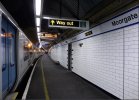
As this is getting a bit off topic nobody has mentioned the great northern moorgate branch which has recently be refurbished with new platform signs which I assume are in RA2
 

Attachments

  • 2794879B-CD63-4204-BEF3-1D0798EFC7A8.jpeg
    2794879B-CD63-4204-BEF3-1D0798EFC7A8.jpeg
    122.5 KB · Views: 339

Dr Hoo

Established Member
Joined
10 Nov 2015
Messages
5,678
Location
Hope Valley
Several Hope Valley stations now feature this rebranding.
1629812076834.jpeg
[Edit: Photograph taken by myself shows newly re-vinyled station name sign at Hope. It is evident that this 'bulges' over previous lettering and Northern branding. Sign is on a post also bearing an ageing digit 1 platform indication, probably of rather greater vintage.]
 
Last edited:

YorksLad12

Established Member
Joined
5 Feb 2020
Messages
2,715
Location
Leeds
Wow, that looks cheap and nasty. Could they not at least have used thicker vinyl?
The thin vinyl also shows that the station sign hadn't been updated since early 2016. There is a certain amount of... cheapness on show, isn't there?

You'd have thought Northern would finish reliverying the trains before starting on the stations. I would, anyway.
 

LowLevel

Established Member
Joined
26 Oct 2013
Messages
8,919
I see someone has taken the trouble to go out on a limb and do Braystones and Nethertown :lol:
 

HarryL

Member
Joined
14 Sep 2020
Messages
264
Location
Leeds
Really can't imagine that any of these early Northern attempts with the dodgy vinyl will pass GBR standards when they finally arrive, can only hope not anyway. Not sure why the DfT/Northern management is having them do all this in a way that'll only have to be redone again properly.

The Network Rail attempt at Paddington that should be happening somewhat soon should be done entirely from scratch in the proper standards so hopefully they'll learn that simply pasting vinyl over existing doesn't cut it and they need to do better.
 

skyhigh

Established Member
Joined
14 Sep 2014
Messages
6,875
Not sure why the DfT/Northern management is having them do all this in a way that'll only have to be redone again properly.
I wouldn't be so sure on that - given the way things always seem to go, I wouldn't be entirely surprised if this is the finished article.
You'd have thought Northern would finish reliverying the trains before starting on the stations. I would, anyw
Which trains still need reliverying then? ;)
 

Meerkat

Established Member
Joined
14 Jul 2018
Messages
9,276
View attachment 101618
[Edit: Photograph taken by myself shows newly re-vinyled station name sign at Hope. It is evident that this 'bulges' over previous lettering and Northern branding. Sign is on a post also bearing an ageing digit 1 platform indication, probably of rather greater vintage.]
That is awful! Bland and soulless. And no way is that going to stand out better than white on blue in a busy station with a background of adverts and shopfronts.
 

YorksLad12

Established Member
Joined
5 Feb 2020
Messages
2,715
Location
Leeds
The platform number is the original BR sign!
That too! But if it ain't broke... ;)

Which trains still need reliverying then? ;)
170456 says (n) northern instead of (n) NORTHERN (or did the other week). There's also a 2-car 158 that just says (n) - no northerm NORTHERN or Northern alongside it. Am wondering if they just under-ordered NORTHERN vinyls! Both spotted at Leeds.
 

vlad

Member
Joined
13 May 2018
Messages
794
The thin vinyl also shows that the station sign hadn't been updated since early 2016. There is a certain amount of... cheapness on show, isn't there?

Apart from one sign at Heaton Chapel, I don't know of any signs at Northern-run stations that have been updated with the name of the new provider since 2016, apart from the old Northern logo being covered with tape. In many of these places the tape is starting to fall off....
 

py_megapixel

Established Member
Joined
5 Nov 2018
Messages
7,491
Location
Northern England
Apart from one sign at Heaton Chapel, I don't know of any signs at Northern-run stations that have been updated with the name of the new provider since 2016, apart from the old Northern logo being covered with tape. In many of these places the tape is starting to fall off....
At the average smallish Northern-run station, I would be entirely unsurprised to learn you'll now find more visible copies of the pre-2016 logo than the modern one.
 

Darandio

Established Member
Joined
24 Feb 2007
Messages
11,141
Location
Redcar
Apart from one sign at Heaton Chapel, I don't know of any signs at Northern-run stations that have been updated with the name of the new provider since 2016, apart from the old Northern logo being covered with tape. In many of these places the tape is starting to fall off....

Hope certainly had tape covering the old logo. Whether it's fallen off or they removed it in a vain attempt to make this vinyl wrap work better is another question!
 

Hadders

Veteran Member
Associate Staff
Senior Fares Advisor
Joined
27 Apr 2011
Messages
18,143
As this is getting a bit off topic nobody has mentioned the great northern moorgate branch which has recently be refurbished with new platform signs which I assume are in RA2
Having seen the relatively recent re-branding at the Northern City Line stations in the flesh I think it looks much better than the RA2 attempt in Northern-land.

It did, of course, look better with NSE stripes rather than the blue strip beneath ;)
 

Bletchleyite

Veteran Member
Joined
20 Oct 2014
Messages
113,534
Location
"Marston Vale mafia"
Having seen the relatively recent re-branding at the Northern City Line stations in the flesh I think it looks much better than the RA2 attempt in Northern-land.

It did, of course, look better with NSE stripes rather than the blue strip beneath ;)

I think that blue top and bottom with RA2 would look quite good. Perhaps even revert to red top and bottom for IC stations.
 

HYPODERMIC

Member
Joined
14 Feb 2011
Messages
88
Location
Chingford
I think the problems with RA2 aren't the typeface itself, or even the use of black on white, it's the combination of:
  • not using a bold enough font/weight on signs, particularly station names

  • the absence of any colour on signage
I don't think you need full colour signage - ala London Midland or Avanti - to look good. In fact, TfL, TfW, Merseytravel, etc, and most TOCs all feature white signage with colour stripes, and that colour stripe is enough to look modern and premium. I think a colour stripe header also helps to each sign to 'pop out' against the background and subconsciously signals to readers that it's a customer information/wayfinding sign rather than a retail advert or staff/operational sign.

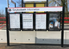
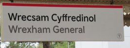
I think the TfW branding shows quite clearly how black on white signage can look very modern and presentable while being uncluttered and straightforward at the same time. So I don't think RA2 is really the problem in and of itself. In fact, I really like the idea of embracing the RA design heritage and adapting it to modern tastes. But I think a splash of colour is needed to stop it looking austere. And a bolder weighting/font to stop it looking cheap. I think GBR can make it work, but some tweaks are going to be needed for it to look good.

If I had access to proper photo editing or design software I'd try to mock up bolder RA2 with colour design elements - I think it would be a big improvement on the slightly anemic-looking vinyls we've seen rolled out so far.
 

Attachments

  • 1.png
    1.png
    523.4 KB · Views: 174
  • 2.png
    2.png
    204.6 KB · Views: 174

the sniper

Established Member
Joined
4 Sep 2007
Messages
3,498
It'd be nice if each sector or region/operator within GBR (depending how they do it) had it's own coloured stripe to differentiate. These plain signs look woeful.
 

Bletchleyite

Veteran Member
Joined
20 Oct 2014
Messages
113,534
Location
"Marston Vale mafia"
It'd be nice if each sector or region/operator within GBR (depending how they do it) had it's own coloured stripe to differentiate. These plain signs look woeful.

BR wasn't far off with these. Blue for regional, red for InterCity. Both colours of the Union Flag. Top and bottom looks good and is different from what is there now (other than the Northern City Line I suppose).

Plain white just looks naff.
 

Grumpy Git

On Moderation
Joined
13 Oct 2019
Messages
2,255
Location
Liverpool
BR wasn't far off with these. Blue for regional, red for InterCity. Both colours of the Union Flag. Top and bottom looks good and is different from what is there now (other than the Northern City Line I suppose).

Plain white just looks naff.

I don't agree.

A railway station is a railway station and a ticket to get from A to B should be valid on any train which stops there. Time to stop all this "not valid on this service" crap, end of.
 

Bletchleyite

Veteran Member
Joined
20 Oct 2014
Messages
113,534
Location
"Marston Vale mafia"
I don't agree.

A railway station is a railway station and a ticket to get from A to B should be valid on any train which stop there, end of.

I think you might have the wrong thread. Colour highlights on signage to make it look less cheap and naff has nothing whatsoever to do with ticketing.
 

Grumpy Git

On Moderation
Joined
13 Oct 2019
Messages
2,255
Location
Liverpool
I think you might have the wrong thread. Colour highlights on signage to make it look less cheap and naff has nothing whatsoever to do with ticketing.

OK, put the effort (therefore funds) into improving the infrastructure, we don't need fancy signage, just clear and uniform.
 

Tio Terry

Member
Joined
2 May 2014
Messages
1,198
Location
Spain
Does adding colour help or hinder those with visual impairments? Opinion seems to be less is more in that black text on a white background is the easiest to differentiate and that adding colour does nothing to help at all but can make signage too "busy"to be easily read.
 

Bletchleyite

Veteran Member
Joined
20 Oct 2014
Messages
113,534
Location
"Marston Vale mafia"
Does adding colour help or hinder those with visual impairments? Opinion seems to be less is more in that black text on a white background is the easiest to differentiate and that adding colour does nothing to help at all but can make signage too "busy"to be easily read.

I very much doubt a narrow strip of colour at the top and bottom of a sign will make a blind bit of difference to accessibility other than making it look better to everyone.
 

Top