_toommm_
Established Member
It’s reached Chathill too:


Because unlike a franchise, GBR is expected to stick around a lot longer so doing the job now means it doesn't need doing again for the long term (Although the Northern examples aren't particularly the proper application and may well end up replaced at some point). The best example of it in action is the BR signage that is still going strong in many stations next to ToC signage that has been replaced multiple times as they've come and gone.When franchises spent money rebranding things this was seen as a bad thing, so why is GBR doing this?

I was at Ribblehead station yesterday.
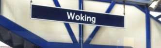
Firstly, the new station signage is just the name boards. The remaining station signage, e.g. 'Way Out', 'this platform for Appleby and Carlisle' etc has not been updated and is still in original Transport font installed by British Rail.
Secondly, the signs are not over-vinyled. They look like new metal signs with stick on black letters.
As for the look of the signs, something doesn't look quite right with them to me. I think they would look much better if a bold typeface had been used. My friend, who is not a rail enthusiast, commented that the old signs stood out better.
That doesn’t explain why they need to do it to perfectly serviceable (and better) signs, other than the sort of branding fetish that is frowned on when franchises did it.Because unlike a franchise, GBR is expected to stick around a lot longer so doing the job now means it doesn't need doing again for the long term (Although the Northern examples aren't particularly the proper application and may well end up replaced at some point). The best example of it in action is the BR signage that is still going strong in many stations next to ToC signage that has been replaced multiple times as they've come and gone.
Perhaps it's been pre-conditioned into people but take food packaging for example.Not really sure I agree with the idea that dark signs are more stylish or classy, and I'm far from convinced I actually want wayfinding signs to be either of those things anyway.
It's worth noting that the RA2 signage project was started long before GBR was conceived, Network Rail began the process in around 2018 and if GBR hadn't happened, this would still be taking place. A big goal in doing it is to bring back together the fragmented branding that's currently going on. While some ToCs had/have reasonable signage, others really don't and that inconsistency is a problem for things like accessibility, where a universal standard is better suited as to know exactly what to look for and be able to definitely read it.That doesn’t explain why they need to do it to perfectly serviceable (and better) signs, other than the sort of branding fetish that is frowned on when franchises did it.
Suppose the argument is that if not the New Routemaster, what other bus would they have used? Routemasters are probably the best known bus in the country (albeit moreso the originals) even outside of London and are iconic in many places even outside of the country. So while they have a specific location tied to them, they are still some of the best to use for a pictogram like this in my opinion.It looks a lot like a Wright New Routemaster, which don't operate outside London, making its use as the national symbol a bit silly.
The Alexander Dennis Enviro MMC series has become pretty representative of buses across the entire country; why not use that? Given they've proven popular with operators, I reckon they'll be around for a good long time yet. There is no sign that production of them - let alone service use - will be stopping any time soon, not forgetting early original E400s are still running around now after 15 years or more.Suppose the argument is that if not the New Routemaster, what other bus would they have used? Routemasters are probably the best known bus in the country (albeit moreso the originals) even outside of London and are iconic in many places even outside of the country. So while they have a specific location tied to them, they are still some of the best to use for a pictogram like this in my opinion.
They're also much less likely to date the graphics vs any other bus model that could well be out of service within the signage lifespan.
The Alexander Dennis Enviro MMC series has become pretty representative of buses across the entire country; why not use that? Given they've proven popular with operators, I reckon they'll be around for a good long time yet. There is no sign that production of them - let alone service use - will be stopping any time soon, not forgetting early original E400s are still running around now after 15 years or more.

It was probably designed by someone who got hold of the pictograms and decided to use them without any formal clearance, and then no-one above in the chain of sign-off noticed. Or cared. Which is another good reason to roll out the design philosophy as soon as possible.Northern have started using the RA2 bus symbol on their posters about engineering works to represent rail replacement buses. It looks a lot like a Wright New Routemaster, which don't operate outside London, making its use as the national symbol a bit silly.
The really bizarre thing is that these posters aren't using RA2 text, they're still using Northern's brand font (Gotham Rounded).
Because that's old, and this is the new. A crap reason, I grant you, but probably the reason. There was the square pictogram of the front of a bus from the side (with the doors) - perfectly understandable and fitted a square space unlike the traffic sign bus which, it turns out, has a version from the other, doorless side when the sign points in the other direction.Why not just use the standard road sign pictogram that appears on most bus stop flags?
Possibly because it's a long way from square and so wouldn't line up properly in a stack of "plank" signs?Why not just use the standard road sign pictogram that appears on most bus stop flags?


When you say "simple and bland" I assume you are referring to the fact that the signs are plain white with only text on them? I imagine that will change when GBR comes in and has its own logo.I don't like the new RA2 it just looks too simple and bland. I would prefer it to be more like the SWT signage an example of it below

Does GBR exist yet? If it does, does it yet have a budget to spend on station signs?When franchises spent money rebranding things this was seen as a bad thing, so why is GBR doing this?

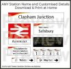
I don't like the new RA2 it just looks too simple and bland. I would prefer it to be more like the SWT signage an example of it below
When you say "simple and bland" I assume you are referring to the fact that the signs are plain white with only text on them? I imagine that will change when GBR comes in and has its own logo.


That's not a problem with the font itself. The problem is that - unlike original RA - they haven't used a bold weight which makes it difficult to pick out. Hopefully they will notice and correct this problem.Beginning to think this isn't going well. Having now seen multiple examples of RA2 at various stations it's obvious to me that it fails in comparison to the original RA. The lightweight typeface looks lost on signboards and against the backdrop of station infrastructure. One of those situations where the neat mockups on a designer's Mac screen fails to translate into the real world.
The weight they're using incorrectly on signage will look excellent on the new unified online booking system, for example, where the thick letters of the original RA would look cluttered and difficult to read.
England can be green...The intention is that it stays plain white, but I do think a simple colour bar at the bottom would really enhance the look. TfW and ScotRail signage looks great with the red and blue bars respectively. It's a shame Wales used red rather than green, as otherwise you'd have had a logical country colour-code there, with red for England, green for Wales and blue for Scotland.


Stagecoach with SWT set the gold standard for signage. Futura font, with some character in the swish. Nothing has come close.
Because those brands will eventually go, the aim is to only have the GBR brand like the BR days. Whether they'll have sub-brands like Regional Railways/Intercity/etc is still yet unknown but there definetly wont be GWR, Avanti, Northern, etc.What if they keep existing station signage as it is ( if it isnt NR signage ) and just put a another sign underneath saying for example " Trains ran by SWR and GWR, Station Managed by GBR " escpecially as new TOCs such as Avanti have released new signage and if it just got replaced after a few years it would just be a waste of money
Thanks I didnt realise that the franchises would actually go, I thought that they would just go onto the concession process with the same brands whilst GBR took care of everything else.Because those brands will eventually go, the aim is to only have the GBR brand like the BR days. Whether they'll have sub-brands like Regional Railways/Intercity/etc is still yet unknown but there definetly wont be GWR, Avanti, Northern, etc.

That is so happy clappy, it's not true.Because those brands will eventually go, the aim is to only have the GBR brand like the BR days. Whether they'll have sub-brands like Regional Railways/Intercity/etc is still yet unknown but there definetly wont be GWR, Avanti, Northern, etc.
GBR will be a rolling program like privatisation, so certain franchises (like Northern and LNER) will be brought under first, and then the rest will follow over the years for a while so at no stage will there be any current franchise managed by GBR. Also the whole point of these new signs are to simplify them and get rid of excess information, adding a board with the very thing they want to get rid of would defeat the purpose.