
Given the fact that many non-local travellers will come from, or be used to, areas that have both trams and metros, to use an internationally recognised pictogram for a tram to point the way to a railway system that is not, and is never referred to as a tram, would be just as confusing as using the local symbol/icon. "But I'm looking for the Metro, not a tram..." The tram symbol would be fine for Manchester, Birmingham , Sheffield, Edinburgh, Nottingham and Blackpool - but Newcastle and Liverpool need something else. How fortuitous that both systems start with an "M"! That just leaves Glasgow - but with only 1 "in-station" interchange anyway and a fairly logical "S" for "Subway" it's not that much of an issueIt’s near enough - the pictogram doesnt show a street does it?
I thought we were discussing pictograms in railway stations

-
Our new ticketing site is now live! Using either this or the original site (both powered by TrainSplit) helps support the running of the forum with every ticket purchase! Find out more and ask any questions/give us feedback in this thread!
You are using an out of date browser. It may not display this or other websites correctly.
You should upgrade or use an alternative browser.
You should upgrade or use an alternative browser.
Stations rebranded to Great British Railways design / Rail Alphabet 2 & 3
- Thread starter JaJaWa
- Start date
Sponsor Post - registered members do not see these adverts; click here to register, or click here to log in
R
RailUK Forums
Bletchleyite
Veteran Member
Given the fact that many non-local travellers will come from, or be used to, areas that have both trams and metros, to use an internationally recognised pictogram for a tram to point the way to a railway system that is not, and is never referred to as a tram, would be just as confusing as using the local symbol/icon. "But I'm looking for the Metro, not a tram..." The tram symbol would be fine for Manchester, Birmingham , Sheffield, Edinburgh, Nottingham and Blackpool - but Newcastle and Liverpool need something else. How fortuitous that both systems start with an "M"! That just leaves Glasgow - but with only 1 "in-station" interchange anyway and a fairly logical "S" for "Subway" it's not that much of an issue
At Liverpool Lime St the "yellow upside down W" is used, and the actual escalator has (or did have) a very prominent text "Merseyrail Underground" above it. Can't really do better than that.
Bletchleyite
Veteran Member
S-Bahn?
(hides)
WAO
It is helpful that Germany has standardised icons and terms for that sort of urban railway. But the UK doesn't so that would just confuse everyone!
If you read the DfT's Design Standards for Accessible Railway Stations, Section K (Page 85) onwards gives details of Signage requirements and references which part of the PRM TSI is applicable along with the applicable part of BS8300.It is helpful that Germany has standardised icons and terms for that sort of urban railway. But the UK doesn't so that would just confuse everyone!

DJ_K666
Member
I'm never said we are. I just said it was what I preferred. And while I'm on the subject, that isn't rail alphabet. It needs to be bolder, more like Arial and fill the whole sign.You know that you're not getting any of this back, right?
jonnyfan
Member
Widnes now has the new signage, just stickered over the existing.
Edit: Also Sankey for Penketh
Edit2: Padgate also
Edit: Also Sankey for Penketh
Edit2: Padgate also
Last edited:
The problem is that as far as online information about the railways is concerned concerned merseyrail trains are just a regular train (IIRC live departures shows them as departing from "platform a"), yet AIUI as far as the signage at Lime street is concerned it's treated more like the London underground. It's a while since I've been to Lime Street, but I don't think the regular departure boards include the merseyrail trains and I don't think the "platform a" nomanclature is used on the ground.At Liverpool Lime St the "yellow upside down W" is used, and the actual escalator has (or did have) a very prominent text "Merseyrail Underground" above it. Can't really do better than that.
If you don't know in advance that merseyrail is special good luck finding your train without asking for help.

But equally does make them look a little cheap. And a lot of white can look fairly garish in sunlight.Not sure what age a lot of the posters are on this thread, but for me as someone approaching 60, the easiest to read are black on a white background
Dark backgrounds tend to "get lost" within their surroundings. They are signs remember not ornaments!
Darker colours have a splash of style and class to them.
That's why a lot of apps and digital "things" have "dark mode" - give it a few years and it'll be enabled by default.
Not sure how good it looks on real world print but the photos at Birmingham looked quite good - a block of black with the info in the middle of it essentially. Shame they didn't go for this - something completely different.
I obsessively use dark mode on apps because it reduces uncomfortable glare from the screen. I'm absolutely fine with normal light-coloured reflective surfaces though, and fine dark-on-light signs much more readable. Not really sure I agree with the idea that dark signs are more stylish or classy, and I'm far from convinced I actually want wayfinding signs to be either of those things anyway.But equally does make them look a little cheap. And a lot of white can look fairly garish in sunlight.
Darker colours have a splash of style and class to them.
That's why a lot of apps and digital "things" have "dark mode" - give it a few years and it'll be enabled by default.
Not sure how good it looks on real world print but the photos at Birmingham looked quite good - a block of black with the info in the middle of it essentially. Shame they didn't go for this - something completely different.
From recent visits to Lime Street, the signage at the top of the escalators to the subway now reads "Lime Street Low Level "The problem is that as far as online information about the railways is concerned concerned merseyrail trains are just a regular train (IIRC live departures shows them as departing from "platform a"), yet AIUI as far as the signage at Lime street is concerned it's treated more like the London underground. It's a while since I've been to Lime Street, but I don't think the regular departure boards include the merseyrail trains and I don't think the "platform a" nomanclature is used on the ground.
If you don't know in advance that merseyrail is special good luck finding your train without asking for help.
The departure boards include a separate display for Merseyrail departures which IIRC states that you have to go to the low level station.
There's also a separate Wirral line departure screen at the top of the escalators accompanied by a sign telling passengers for the Northern line to board the first Wirral line train and change at Central
But equally does make them look a little cheap. And a lot of white can look fairly garish in sunlight.
Darker colours have a splash of style and class to them.
That's why a lot of apps and digital "things" have "dark mode" - give it a few years and it'll be enabled by default.
Not sure how good it looks on real world print but the photos at Birmingham looked quite good - a block of black with the info in the middle of it essentially. Shame they didn't go for this - something completely different.
Take a look at the requirements for PRM. Signs have to be supportive of people with poor eyesight as well as those with good eyesight.
Intercity 225
Member
- Joined
- 2 Mar 2014
- Messages
- 329
Given the fact that many non-local travellers will come from, or be used to, areas that have both trams and metros, to use an internationally recognised pictogram for a tram to point the way to a railway system that is not, and is never referred to as a tram, would be just as confusing as using the local symbol/icon. "But I'm looking for the Metro, not a tram..." The tram symbol would be fine for Manchester, Birmingham , Sheffield, Edinburgh, Nottingham and Blackpool - but Newcastle and Liverpool need something else. How fortuitous that both systems start with an "M"! That just leaves Glasgow - but with only 1 "in-station" interchange anyway and a fairly logical "S" for "Subway" it's not that much of an issue
I’ve quoted your post in order to give context to this post but please don’t think I necessarily disagree.
That said, wouldn’t the best solution be to just drop the logos altogether and simply have signage point to whatever the light rail option(s) in the respective cities are branded as? Written in text… in Rail Alphabet 2 of course…
At Kings Cross today, they seem to be trying out the airport branding (inverse) on the downstairs toilets (it extends inside too). It's definitely something new in the last few weeks - note the contrast with the ordinary white on blue signage.
I'm not sure why, it looks a bit of a mess to be honest having two different design systems in the same station.
The relevance to this thread - why, if they are rolling out RA2 and a new design system, is Kings Cross seemingly doing something totally different?!
I'm not sure why, it looks a bit of a mess to be honest having two different design systems in the same station.
The relevance to this thread - why, if they are rolling out RA2 and a new design system, is Kings Cross seemingly doing something totally different?!
Attachments
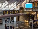
Okay. I get the mens, womens and disabled toilet signs, but what does the person-in-wheelchair-being-knocked-backwards-by-a-man-with-a-pole-and-rescued-by-a-drone sign mean?At Kings Cross today, they seem to be trying out the airport branding (inverse) on the downstairs toilets (it extends inside too). It's definitely something new in the last few weeks - note the contrast with the ordinary white on blue signage.
I'm not sure why, it looks a bit of a mess to be honest having two different design systems in the same station.
The relevance to this thread - why, if they are rolling out RA2 and a new design system, is Kings Cross seemingly doing something totally different?!
Baby Changing facilities? And a hoist in the disabled toilet?Okay. I get the mens, womens and disabled toilet signs, but what does the person-in-wheelchair-being-knocked-backwards-by-a-man-with-a-pole-and-rescued-by-a-drone sign mean?
I guess they would tend to be ones you'd learn if you needed them to be fair.Baby Changing facilities? And a hoist in the disabled toilet?
haggishunter
Member
- Joined
- 25 Aug 2016
- Messages
- 349
Okay. I get the mens, womens and disabled toilet signs, but what does the person-in-wheelchair-being-knocked-backwards-by-a-man-with-a-pole-and-rescued-by-a-drone sign mean?
Symbol for Changing Places Toilets - see https://www.changing-places.org/ .
Seems as though Network Rail have given up on standardising the old signage now that the new stuff is on the way, there's a bunch of newer signs that are all over the place in a few stations at the moment. Not sure when Kings Cross is intended to get the new stuff but given Paddington hasn't started getting it yet, it'll probably be a while.The relevance to this thread - why, if they are rolling out RA2 and a new design system, is Kings Cross seemingly doing something totally different?!

I was at Ribblehead station yesterday.
Firstly, the new station signage is just the name boards. The remaining station signage, e.g. 'Way Out', 'this platform for Appleby and Carlisle' etc has not been updated and is still in original Transport font installed by British Rail.
Secondly, the signs are not over-vinyled. They look like new metal signs with stick on black letters.
As for the look of the signs, something doesn't look quite right with them to me. I think they would look much better if a bold typeface had been used. My friend, who is not a rail enthusiast, commented that the old signs stood out better.
Firstly, the new station signage is just the name boards. The remaining station signage, e.g. 'Way Out', 'this platform for Appleby and Carlisle' etc has not been updated and is still in original Transport font installed by British Rail.
Secondly, the signs are not over-vinyled. They look like new metal signs with stick on black letters.
As for the look of the signs, something doesn't look quite right with them to me. I think they would look much better if a bold typeface had been used. My friend, who is not a rail enthusiast, commented that the old signs stood out better.


Firstly, the new station signage is just the name boards. The remaining station signage, e.g. 'Way Out', 'this platform for Appleby and Carlisle' etc has not been updated and is still in original Transport font installed by British Rail.
Secondly, the signs are not over-vinyled. They look like new metal signs with stick on black letters.
As for the look of the signs, something doesn't look quite right with them to me. I think they would look much better if a bold typeface had been used. My friend, who is not a rail enthusiast, commented that the old signs stood out better.
I passed through on the S&C a few days ago and also noticed that a significant number of other signs at the stations are BR originals - although they're in the original Rail Alphabet typeface rather than Transport (which is the one for road signs). The comparison between those signs and the new name boards does illustrate clearly that a heavier weight of Rail Alphabet was used previously and that it should be used again.
I disagree that they're new metal signs, though. Given some that I saw had slight wrinkling in the white portions, I suspect that the preceding sign has been completely covered by a sheet of white vinyl to which the black vinyl letters have subsequently been attached.
The new RA2 signs are definitely vinyl over existing, at least the examples I've seen are, its hard to tell but from certain angles you can see the old letters extruding out underneath the white. It's also why they've been able to do it so relatively fast, a large number have now sprung up all over the Northern network.
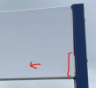
There's also a few that haven't quite been applied properly as mentioned, in one of the photos on the first post of this thread, you can just about notice that they've missed the bottom edge with the vinyl.
There's also a few that haven't quite been applied properly as mentioned, in one of the photos on the first post of this thread, you can just about notice that they've missed the bottom edge with the vinyl.
Attachments
Last edited:
Meant to say Rail Alphabet, God knows why I wrote Transport!I passed through on the S&C a few days ago and also noticed that a significant number of other signs at the stations are BR originals - although they're in the original Rail Alphabet typeface rather than Transport (which is the one for road signs). The comparison between those signs and the new name boards does illustrate clearly that a heavier weight of Rail Alphabet was used previously and that it should be used again.
I disagree that they're new metal signs, though. Given some that I saw had slight wrinkling in the white portions, I suspect that the preceding sign has been completely covered by a sheet of white vinyl to which the black vinyl letters have subsequently been attached.

Assuming this is your personal design, you should present this to the powers that be. I would absolutely love this if they used this as the new symbol.
Well done you.
It is derived from the branding for British Rail International, which has existed since at least 1980:
emoaconr
Member
They do now.The problem is that as far as online information about the railways is concerned concerned merseyrail trains are just a regular train (IIRC live departures shows them as departing from "platform a"), yet AIUI as far as the signage at Lime street is concerned it's treated more like the London underground. It's a while since I've been to Lime Street, but I don't think the regular departure boards include the merseyrail trains and I don't think the "platform a" nomanclature is used on the ground.
Also looks possible now that Liverpool City Region CA will aim to transfer the infrastructure to Merseytravel from Network Rail. What that might mean in operational terms might end up being like TfW's Valley Lines , or on the other side of the scale, like the Tyne and Wear Metro.

_toommm_
Established Member
Cumbrian Coast Line has been rebranded.
The heritage signs at Workington Main that hang from the roof are still there though.
The heritage signs at Workington Main that hang from the roof are still there though.

Steddenm
Established Member
Layton has the new branding I noticed today.