• Our new ticketing site is now live! Using either this or the original site (both powered by TrainSplit) helps support the running of the forum with every ticket purchase! Find out more and ask any questions/give us feedback in this thread!

Trivia: Lost modern "classic" liveries

Status
Not open for further replies.

TheGrandWazoo

Veteran Member
Joined
18 Feb 2013
Messages
22,965
Location
Somerset with international travel (e.g. across th
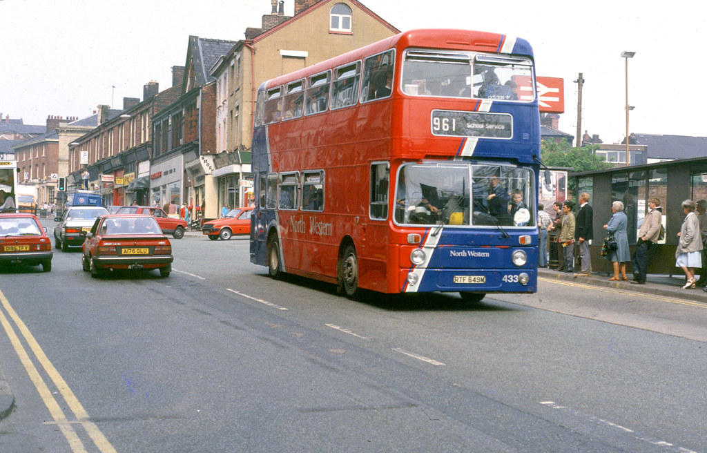
The posting of a c.1987 North Western picture got me thinking.... we have seen the introduction of the big 3 corporate liveries (though First are rowing back on that in many locations) and people often get misty eyed at stuff like traditional lined out municipal liveries of the 1950s.

However, what are the more modern (deregulation to present) liveries that have come and sadly gone? Granted, it's very subjective so be nice, and it's not a referendum on Ray Stenning. Also, emphasis on the lost liveries. My initial nominations....

  • London & Country - really refreshed a very downbeat LC(SW)
  • Go Ahead Northern - a very simple, very smart livery that stepped away from the NBC/TWPTE era Northern General
  • MTL Merseyside - the version that was introduced post Merseybus and came with Wright B10Bs. Looked very smart when new (though did look worse as MTL's woes intensified
  • Midland Fox - yes, it did appear just before dereg but was one that really did come of age in deregulation
What do other people reckon?
 
Sponsor Post - registered members do not see these adverts; click here to register, or click here to log in
R

RailUK Forums

tbtc

Veteran Member
Joined
16 Dec 2008
Messages
18,058
Location
Reston City Centre
Doncaster Mainline: https://www.flickr.com/photos/tarquinius_superbus/7463179132

Even by the standards of uninspiring municipals with uninspiring liveries, South Yorkshire Transport had a fairly dull brown/cream livery, which was (later) livened up with some red. But in a post-deregulation era of colourful independents, they repainted the double deckers on the busy cross-city 81/84 corridor in a vivid red/yellow livery and called it "Mainline".

That seemed to work so well that other routes got the treatment over the next few years (converting one route/corridor at a time, rather than haphazardly applying it to any old vehicle - something that First/Stagecaoch repaints ought to pay more attention to), giving the impression of an upgrade (even when it was just the same vehicles as before) - the virtuous cycle continued until the point that the whole operation became "Mainline", and the yellow/red livery adopted across the main fleet.

However, Rotherham and Doncaster initially got their own versions of "Mainline" - Rotherham had a deep blue and yellow scheme in a similar pattern to the Sheffield red/yellow, but Doncaster went one further and adopted a main grey scheme with red and yellow used a lot more sparingly (see picture linked above).

IMHO it looked wonderful - the bright colours standing out more through their sparing use (I don't mind some of the vivid pink/turquoise/ orange etc that modern operators use but it works a lot better as a relief to a main duller colour) - red wheels made it stand out too.

There was no gimmick, no cartoon characters or complicated swoops or wacky pun, it was easy to sort out for replacement panels, I didn't see a bad example of a repaint (compared to some modern liveries where certain local depots can apply really haphazard interpretations of what they think Head Office asked for).

I think the Doncaster scheme looked quite futuristic and would have worked well on modern vehicles (where the large black areas taken up by modern glazing etc mean there's little space for a livery to really work - flashes of bight yellow and red would be a nice contrast upon an E400 etc).

Most enthusiasts I've spoken with seemed to really dislike the Doncaster scheme and it didn't last very long - the whole fleet in South Yorkshire was "unified" into something based on the Sheffield livery but with narrow bands of deep blue and grey as a nod to the Rotherham/Doncaster liveries - when First took over in the late '90s any repaints became the simple red/yellow that Sheffield had started out with in the first place. Though the entire "Mainline" era was less than a decade, and went through the changes mentioned above, it's still the name that people use for "First South Yorkshire" - it seems to have a resonance in that I've even heard people use it who only moved to this neck of the woods post-1998.

So, I'll nominate the Doncaster Mainline livery on the grounds that it is a "lost" livery (i.e. no longer around), it was the livery of the whole depot (rather than being restricted to one vehicle or only a temporary advertising livery) and lasted for a few years.

(As a "next best" post-deregulation livery, I'll suggest the "express" scheme that Kelvin Scottish had on the Cumbernauld corridor - a reverse of the regular "yellow front, blue rear" scheme - I thought that looked fabulous at the time)
 

RustySpoons

Member
Joined
5 Apr 2019
Messages
869
I still miss the last of the Blazefield liveries

https://flic.kr/p/CSebCY

Looked good on every vehicle it was painted on with different colours for different depots (red for Burnley & Harrogate, blue for Coastliner and Lancs Utd. and teal for Keighley), and I still don't think it's aged at all and would still look just as good if it was in use today.
 

baza585

Member
Joined
1 Aug 2010
Messages
725
People's Provincial. Two tone green and cream with red wheels. Stunning even on clapped out Leyland Nationals......
 

jammy36

Member
Joined
28 Aug 2013
Messages
324
As said, very subjective, but three of my personal favourites are

Western National's cream, red and blue scheme which I thought looked classy and refreshing. Not as brash as the preceding red, blue, yellow and white "Captain Birdseye" and sat better on older vehicles than the later "flags/tickets" scheme

Wilts & Dorset's red, white and black scheme was both modern and elegant:

And yes, it's a Stenning scheme, but I thought that his Maidstone & District scheme was really very good
 
Joined
27 Jan 2012
Messages
44
I rather liked the North Western blue/red Diagonal livery and Northumbria red/white/grey. I recall reading they were from the same design agency but my memory isn't good enough to remember which.

The earlier Kelvin yellow front livery with the broad blue band that continued along the skirt I felt was very striking too.

Of the more conventional layouts that have gone, I always liked the Tyne & Wear PTE/Busways yellow/white, Highland Scottish red/grey and Kentish Bus maroon/primrose.


Not my photos - credit to uploaders
 

Redmike

Member
Joined
13 May 2018
Messages
177
So many of thr post deregulation liveries come to mind.

Crosville and C Line used this livery


PMT


Trent


East Midland


TheGrandWazoo

Veteran Member
Joined
18 Feb 2013
Messages
22,965
Location
Somerset with international travel (e.g. across th
Some belters here!!

Wilts and Dorset post privatization livery.
I agree - whether it was a Metrorider or a VR, can't think of a vehicle type it didn't look good on

So, I'll nominate the Doncaster Mainline livery on the grounds that it is a "lost" livery (i.e. no longer around), it was the livery of the whole depot (rather than being restricted to one vehicle or only a temporary advertising livery) and lasted for a few years.
Not one that sprang to mind but beautifully and eloquently argued

I still miss the last of the Blazefield liveries
Again, one that hadn't immediately been in my thoughts but yes, understand those and I did like the K&D version

People's Provincial. Two tone green and cream with red wheels. Stunning even on clapped out Leyland Nationals......
Yeah, it had a smart almost municipal yet modern feel to it and it was smart on 18 year old Nationals

I rather liked the North Western blue/red Diagonal livery and Northumbria red/white/grey. I recall reading they were from the same design agency but my memory isn't good enough to remember which.
You're quite right. Both NW and NMS were designed by an agency called Hayden Hyphen (IIRC). I always felt they looked better on the more modern designs and not so good on ex Lothian Atlanteans (NW) or VRs/LHs (NMS) but that's again subjective. When NW then went for a simplified design, it lost a lot of its impact.

I always liked the Tyne & Wear PTE/Busways yellow/white

The cadmium yellow and white was synonymous with Newcastle (and later T&W) and I liked the Shields version most with the blue relief added.
 

bussnapperwm

Established Member
Joined
18 May 2014
Messages
1,527
Travel West Midlands low floor livery and also their Premier 997 livery. How i miss them!
 
Joined
27 Jan 2012
Messages
44
You're quite right. Both NW and NMS were designed by an agency called Hayden Hyphen (IIRC). I always felt they looked better on the more modern designs and not so good on ex Lothian Atlanteans (NW) or VRs/LHs (NMS) but that's again subjective. When NW then went for a simplified design, it lost a lot of its impact.


The cadmium yellow and white was synonymous with Newcastle (and later T&W) and I liked the Shields version most with the blue relief added.

I agree about the revised NW livery using a horizontal layout, it lost its flair and just seemed a bit like a poor imitation of Accrington corp.

Funny you should mention the South Shields version with the blue, it was also my preferred version of the Busways livery, for me because it reflected the T&W PTE livery closest. I really liked the PTE logo too, always felt it was that finishing touch on the livery


Statto

Established Member
Joined
8 Feb 2011
Messages
4,097
Location
At home or at the pub
PMT liveries on Crosville & RedRider

Merseybus post d-reg liveries

GM Buses liveries including the GM Express livery

North Western post d-reg liveries, i did like the final pre Arriva livery too
 

smtglasgow

Member
Joined
15 Feb 2011
Messages
504
Location
Glasgow & London
Used to visit family in Luton and Hemel a lot in the 90s – both the red and cream Luton Bus and the later blue and yellow The Shires liveries were good. Closer to home, the final iteration of Kelvin Central’s many livery variations (KCB Network) seemed a bit boring at the time, but with hindsight was actually very smart.
 

Romsey

Member
Joined
30 Nov 2019
Messages
356
Location
Near bridge 200
I agree that the Wilts and Dorset 1990's livery as tasteful, but the plain red with a blue skirt panel was reasonable as well. The proportions have changed as the Poole operation morphed into "More" and Salisbury Reds is just dull....Kentish Bus was something different and modern, but had a heritage feel, using cream instead of brilliant white for the base colours.
Something a bit "left field" was the first Stagecoach Rail-link bus livery for the virtual branchlines to Romsey and Bordon. The later livery was a bit too much of a good thing trying to copy the new SWT "parrot" livery.
 

Attachments

  • 13877 W&D1140 (ScaniaELC) Millbrook 26 Apr 2014.jpg
    13877 W&D1140 (ScaniaELC) Millbrook 26 Apr 2014.jpg
    352 KB · Views: 59
  • 8860 SC NFX667 Waterloo 5 Feb 1996.jpg
    8860 SC NFX667 Waterloo 5 Feb 1996.jpg
    1.2 MB · Views: 65

Tetchytyke

Veteran Member
Joined
12 Sep 2013
Messages
17,607
Location
Isle of Man
It's hard to decide what's a good livery and what is just nostalgia. I grew up in West Yorkshire and I always thought the original Yorkshire Rider livery was good. It looked smart on everything they painted it on, even the really old Fleetlines, and the ECW VRs they inherited from West Yorkshire Road Car.


The West Riding/Yorkshire Woollen livery was just boring.

The late-90s Go North East livery was well done, again even on really old buses, and it still looks better than the corporate livery they have 20 years later.


Bus Lightyear

Member
Joined
16 Nov 2018
Messages
542
I always had a liking for the liveries that GRT rolled out on their subsidiaries. When FirstBus acquired SB holdings in 1996 I hoped they would adapt a cream, red and orange livery on the same basis but they went for all over red instead.

Not my photos, credit to the photographers.


Bus Lightyear

Member
Joined
16 Nov 2018
Messages
542
A nice livery and a rather unusual bus. Only 3 of these Metrobuses which resembled Ailsas were ever produced.
 

86247

Member
Joined
12 Feb 2017
Messages
329
Location
clock face
I have been watching a lot of old YouTube bus vids lately and the wilts and Dorset livery is very nice same as the provincial livery.The north Western one brings back happy memories of the diagonal colour scheme.
 

buslad1988

Member
Joined
28 Dec 2018
Messages
651
The late-90s Go North East livery was well done, again even on really old buses, and it still looks better than the corporate livery they have 20 years later.

Loved this livery! Looked great on any bus design, striking and stood out a mile! Nice subtle logos for Easy Access and Xpress brands too. Ruined it when they dropped the zig zags for a diagonal line.
 

GusB

Established Member
Joined
9 Jul 2016
Messages
8,160
Location
Elginshire
I always had a liking for the liveries that GRT rolled out on their subsidiaries. When FirstBus acquired SB holdings in 1996 I hoped they would adapt a cream, red and orange livery on the same basis but they went for all over red instead.

Not my photos, credit to the photographers.

Agreed. That was the style that Grampian introduced in the late 80s, and it looked good using the colour variations of the GRT subsidiary companies. The version they introduced shortly afterwards was nice too, but by that time application was a bit haphazard, perhaps not in mother Aberdeen, but especially on the Lowland and SMT fleets.

They could have done so much better in Glasgow than allover red.
 

Megafuss

Member
Joined
5 May 2018
Messages
893
Location
Spalding
The Red and Orange of Tees and District is a big miss when you compare it to what ArRRIVA churn out these days.

Very simple but very smart as well
 

TheGrandWazoo

Veteran Member
Joined
18 Feb 2013
Messages
22,965
Location
Somerset with international travel (e.g. across th
It's interesting the ones that people liked. Most I agree but (and it is all personal opinion) but I was never a great fan of the W&D Red and Blue nor the later diagonal Tees livery.

Of the Stenning examples, the revamped M&D was good but I do agree that the Shires blue and yellow was really good, even on 20 year old VRs, and it helped with the local names like Gade Valley or Aylesbury & The Vale.

After a number of less successful schemes, Midland Red North came up with a nice one https://www.flickr.com/photos/mals_...7-26eLF5W-M4ZRvc-2iRxRui-SJZqsj-oW7Dz5-rmY8eu In fact, there were some nice ones that Arriva culled
 
Joined
28 Mar 2017
Messages
35
The posting of a c.1987 North Western picture got me thinking.... we have seen the introduction of the big 3 corporate liveries (though First are rowing back on that in many locations) and people often get misty eyed at stuff like traditional lined out municipal liveries of the 1950s.

Ironically, the North Western colours appear to have been resurrected in a slightly more contemporary fashion by rival Warrington's Own Buses! (Red was always the traditional corpy colour, but primrose and blue are the rugby club colours, and were used for a while on their coaches.)
 

TheGrandWazoo

Veteran Member
Joined
18 Feb 2013
Messages
22,965
Location
Somerset with international travel (e.g. across th

RustySpoons

Member
Joined
5 Apr 2019
Messages
869
Here's one that I'm not sure many (if any) will agree with, but the National Express 'Better Connections' livery.


It's one that I liked at the time and still sticks in my head even today, big bold and simple it was instantly recognisable as a National Express service.
 

TheGrandWazoo

Veteran Member
Joined
18 Feb 2013
Messages
22,965
Location
Somerset with international travel (e.g. across th
Here's one that I'm not sure many (if any) will agree with, but the National Express 'Better Connections' livery.


It's one that I liked at the time and still sticks in my head even today, big bold and simple it was instantly recognisable as a National Express service.

I liked it more than the one that replaced it but not quite as the old venetian blind. Talking of NX, I quite liked this Stenning design but on reflection, perhaps a bit much going on??


It only last two years or so until NX bought Flightlink
 

scosutsut

Established Member
Joined
1 Jan 2019
Messages
1,222
Location
scosutsut
Great question OP!
The earlier Kelvin yellow front livery with the broad blue band that continued along the skirt I felt was very striking too.
Not my photos - credit to uploaders
Agree, it was a cracker!
Kelvin Central’s many livery variations (KCB Network) seemed a bit boring at the time, but with hindsight was actually very smart.
It really was, traditional and restrained but equally smart on the older elements of the fleet and the newer Volvo B6/B10B and B10Ms they had at the time.
They could have done so much better in Glasgow than allover red.
I couldn't make sense of it at the time, it was different enough to the existing liveries to require full repaints of everything, didn't even utilise the red that already existed, and looked absolutely uninspiring.

Ironically the Strathclyde Orange (sorry Strathclyde Red) and Black would probably adapt well now to modern vehicles with all the black surrounds!
 
Status
Not open for further replies.

Top