Errr... noSo is Megabus to be rebranded as Stagecoach Connect if this goes ahead then?

-
Our new ticketing site is now live! Using either this or the original site (both powered by TrainSplit) helps support the running of the forum with every ticket purchase! Find out more and ask any questions/give us feedback in this thread!
You are using an out of date browser. It may not display this or other websites correctly.
You should upgrade or use an alternative browser.
You should upgrade or use an alternative browser.
Stagecoach Repaint Updates
- Thread starter overthewater
- Start date
- Status
- Not open for further replies.
Sponsor Post - registered members do not see these adverts; click here to register, or click here to log in
R
RailUK Forums
RomeoCharlie71
Established Member
I disagree - I always found the green swoops to be very tacky looking.I've always found the green hybrid livery to be quite effective, though they seem to be discontinuing it. Could have been a good livery for all buses, to show they care about the environment etc etc with this latest climate change awareness

Jordan Adam
Established Member
I know it would take quite a long time but still cost money.
The buses will get repainted away, this new scheme would be cheaper to apply to vehicles than beachball.
Also people are used to the beachball livery which is relatively highly regarded (according to surveys). The time taking to rebrand would depreciate the brand which seems costly and stupid. Best leave it as it is and get rid of all the other brands.
Beachball is outdated, tacky and doesn't work on newer bus types. The red and blue fade really fast and get dirty easily, while the swoops are inconsistently painted with many variations of the swoop. Out of all the major UK companies Stagecoach are by far the most in need of a refresh. I've always said the Stagecoach interior looks like the sports direct store room.

GusB
Established Member
People were also used to the stripes previously carried by the Stagecoach fleet (perhaps less highly regarded, though) for 20+ years. When was Beachball introduced? My recollection is that it was around 2000-2001, so it has been with us for almost as long as its predecessor. It's long overdue for a refresh.
Exactly, both stripes and beachball lasted about 20 years each, likely a rebrand will go ahead.People were also used to the stripes previously carried by the Stagecoach fleet (perhaps less highly regarded, though) for 20+ years. When was Beachball introduced? My recollection is that it was around 2000-2001, so it has been with us for almost as long as its predecessor. It's long overdue for a refresh.
Jordan Adam
Established Member

I'll just say I've known about it for ages plus one! However (if I had) i'd suspect I'd keep quiet about it in case somebody associated me with it!The coach livery is alright, but the others? I do hope that it will later and that is just for certain routes.
A stagecoach west driver/head repainter has commented on a facebook group saying he has known about this for ages..
The original Stagecoach livery was jarring when it came out however the beachball livery took the same elements but made a proper looking livery out of it.
These just appear to be the level of blandness of the NBC liveries updated with a few modern twists. Given that Arriva appear to have achieved something nearly as bland perhaps the plan is to make buses blend into the background so much that local Councillors will stop seeing them, stop picking on them when told to clean up air pollution and turn on something that would make a difference like taxis or private cars!
That coach livery might look ok, if it was meant to be a classy subdued livery for the executive coach tour or hire market.
But it’s hardly eye catching and selling the product like the current Stagecoach Express livery does on the coaches.
But it’s hardly eye catching and selling the product like the current Stagecoach Express livery does on the coaches.
New liveries looked better on the computer render, although the big graphics obscuring the windows at the front is an abysmal idea.
The navy vinyl wrap on the Plaxton looks all the worse with the clearly visible white edges everywhere.
Great liveries sizzle. This one is limp and cold in the frying pan.
The navy vinyl wrap on the Plaxton looks all the worse with the clearly visible white edges everywhere.
Great liveries sizzle. This one is limp and cold in the frying pan.

TheGrandWazoo
Veteran Member
It's odd that Ray Stenning and Best Impressions get so much stick from enthusiasts (e.g. same old designs, phoning it in, etc) and yet you see these and perhaps understand quite how good Stenning et al are. The Stagecoach beachball is a modern classic and perhaps just needs some tweaking to make it simpler, easier and cheaper to apply.
In terms of the new colours, I find the coach livery is dark and depressing IMHO. The bus liveries are a little better. The red and gold mock up looked ok but less so in the flesh and not as good as NX West Midlands use of similar colours.
The Stagecoach livery appeared in 2000 and I think replaced the stripes by 2006 - there were certainly some examples in Northants and Devon at that time. Note that's still better than First (still plenty of Barbie in certain fleets like West of England, East of England after 7 years) and Arriva (with North East still with a number of original Arriva liveried vehicles after 9 years).
I know it's personal preference but I still find these liveries better than the "new" Arriva scheme, with its insipid colours (only the Sapphire has some accent colour) and clunky route branding.
In terms of the new colours, I find the coach livery is dark and depressing IMHO. The bus liveries are a little better. The red and gold mock up looked ok but less so in the flesh and not as good as NX West Midlands use of similar colours.
The Stagecoach livery appeared in 2000 and I think replaced the stripes by 2006 - there were certainly some examples in Northants and Devon at that time. Note that's still better than First (still plenty of Barbie in certain fleets like West of England, East of England after 7 years) and Arriva (with North East still with a number of original Arriva liveried vehicles after 9 years).
I know it's personal preference but I still find these liveries better than the "new" Arriva scheme, with its insipid colours (only the Sapphire has some accent colour) and clunky route branding.

Tetchytyke
Veteran Member
It's odd that Ray Stenning and Best Impressions get so much stick from enthusiasts (e.g. same old designs, phoning it in, etc) and yet you see these and perhaps understand quite how good Stenning et al are.
I think Stenning has been a pastiche of himself for quite a few years now, but Best Impressions were genuinely ground-breaking. Part of the issue, truthfully, is that BI liveries became so ubiquitous, with little variation between efforts. Not that is necessarily Stenning's fault; people go to Stenning because they want a Stenning.
As for the coach, I think the royal blue looks classy. It looks more luxurious than a beachball coach. Needs a bit of accent colour though, like on the similar (dark grey not royal blue) Falcon livery.
Beachball has had its day. New buses in it have more and more white and less and less colour. The version on the E200MMCs is terrible. But again a bit of accenting is needed on the red, something like a subtle version of the old London beachball livery maybe?
Great_Western
Member
- Joined
- 18 May 2016
- Messages
- 207
Probably contravrsial, but I quite like all three. Especially the red varient. The coach would look better if they grey accents were white, and I think the logo is a bit strange, the colours just seem overly dull. However certainly not a bad effort, especially compared to say, Arriva.
The problem is that with the likes of Go Ahead and First heading towards strong local brands, the corporate scheme just won't age well. But that's something time will tell.
Beachball certainly is an iconic livery, and suited the buses of the early 00's exceptionally well, but time goes on and it is definitely starting to look outdated. Whilst it looks alright on Solo SR's, the removal of the extra blue up front cheapens the look further.
The problem is that with the likes of Go Ahead and First heading towards strong local brands, the corporate scheme just won't age well. But that's something time will tell.
Beachball certainly is an iconic livery, and suited the buses of the early 00's exceptionally well, but time goes on and it is definitely starting to look outdated. Whilst it looks alright on Solo SR's, the removal of the extra blue up front cheapens the look further.
Probably contravrsial, but I quite like all three. Especially the red varient. The coach would look better if they grey accents were white, and I think the logo is a bit strange, the colours just seem overly dull. However certainly not a bad effort, especially compared to say, Arriva.
The problem is that with the likes of Go Ahead and First heading towards strong local brands, the corporate scheme just won't age well. But that's something time will tell.
Beachball certainly is an iconic livery, and suited the buses of the early 00's exceptionally well, but time goes on and it is definitely starting to look outdated. Whilst it looks alright on Solo SR's, the removal of the extra blue up front cheapens the look further.
I wouldn’t call it “effort” though. They’ve designed the logo like a generic small business, not one that when you look at it you can make out its unique to Stagecoach. They’ve got a bus, painted it a colour and stretched out the logo across the rear of the bus.

tbtc
Veteran Member
Whilst funky patterns look great on a computer, my boring answer to seeing complicated design like these (and whilst they are predominantly one colour on the side of the vehicle, there's all of the fussy bits of "beachball" to consider) is "how is it going to look after an RTC, when a replacement panel is added (or a repaint done)?
There are plenty of buses around that look terrible because the depot has pressed it back into service with a plain coloured panel that ruins a curved bit of livery (e.g. the First willowleaf).
Whilst I appreciate that the depot are better to get a bus back into revenue earning service (rather than depriving passengers by keeping it in the depot because the livery doesn't look perfect!), the bus livery should be designed with such inevitable problems in mind - keep it simple at the bottom of the vehicle because these are the panels that will get bashed - keep the vibrant patterns for higher up!
(there's also the problem that a national operator like Stagecoach needs to have a livery that doesn't clash too much with independents from the Highlands to Kent and Devon - so a plain colour scheme might come up against a local operator who already uses that colour)
True
That's pretty poor, given that the buses are out in front line service (and that a large number of buses that were in Barbie in 2012 have been scrapped over the past seven years)
Agreed - I think something like the "Gold" branding works well, with just enough gold to off-set the deep blue.
Re the above two posts - I like "beachball" - I think it has worked well - but it's a livery that works best with a swooping blue at the front to balance the swooping red at the rear - and the modern trend for buses to have big windows and destination screens with lots of *black* isn't suited to the leading swoops - so I can see why they are evolving - modern buses seem to look much bolder which conversely means that bold liveries don't work so well on them (as there's not enough space to get your distinctive colours onto them)
There are plenty of buses around that look terrible because the depot has pressed it back into service with a plain coloured panel that ruins a curved bit of livery (e.g. the First willowleaf).
Whilst I appreciate that the depot are better to get a bus back into revenue earning service (rather than depriving passengers by keeping it in the depot because the livery doesn't look perfect!), the bus livery should be designed with such inevitable problems in mind - keep it simple at the bottom of the vehicle because these are the panels that will get bashed - keep the vibrant patterns for higher up!
(there's also the problem that a national operator like Stagecoach needs to have a livery that doesn't clash too much with independents from the Highlands to Kent and Devon - so a plain colour scheme might come up against a local operator who already uses that colour)
It's odd that Ray Stenning and Best Impressions get so much stick from enthusiasts (e.g. same old designs, phoning it in, etc) and yet you see these and perhaps understand quite how good Stenning et al are
True
First (still plenty of Barbie in certain fleets like West of England, East of England after 7 years)
That's pretty poor, given that the buses are out in front line service (and that a large number of buses that were in Barbie in 2012 have been scrapped over the past seven years)
As for the coach, I think the royal blue looks classy. It looks more luxurious than a beachball coach. Needs a bit of accent colour though, like on the similar (dark grey not royal blue) Falcon livery
Agreed - I think something like the "Gold" branding works well, with just enough gold to off-set the deep blue.
Beachball has had its day. New buses in it have more and more white and less and less colour. The version on the E200MMCs is terrible. But again a bit of accenting is needed on the red, something like a subtle version of the old London beachball livery maybe?
Beachball certainly is an iconic livery, and suited the buses of the early 00's exceptionally well, but time goes on and it is definitely starting to look outdated. Whilst it looks alright on Solo SR's, the removal of the extra blue up front cheapens the look further.
Re the above two posts - I like "beachball" - I think it has worked well - but it's a livery that works best with a swooping blue at the front to balance the swooping red at the rear - and the modern trend for buses to have big windows and destination screens with lots of *black* isn't suited to the leading swoops - so I can see why they are evolving - modern buses seem to look much bolder which conversely means that bold liveries don't work so well on them (as there's not enough space to get your distinctive colours onto them)
Tetchytyke
Veteran Member
The problem is that with the likes of Go Ahead and First heading towards strong local brands
Ironically, around here Go are reverting towards a corporate livery of red with a blue swoosh at the back!
I'm not impressed, either, but one thing that hasn't been mentioned is the typeface: it's lifeless. It's not as bad as the one that Network West Midlands use (e.g. on railway station signs), but it's pretty bad. Unexciting.
I don't understand how high quality liveries and interior decor (especially: the various iterations of Gold) can co-exist with the utterly dross current (and long-standing) Irn Bru interiors or indifferent and bland liveries, as proposed here, in the same company.
I'd don't mind the red variant, but it's pretty generic - it's not as if there are no other red buses running around in many parts of the UK. The green is horrid - mint toothpaste, washed out, and too similar to Arriva (and surely Stagecoach are too good an operator to want to be confused with them....?). The blue just seems outdated and unremarkable: not horrible, but also not distinctive.
Sure, the beachball needs an update - not least as bus design has moved on substantially since it was introduced - but it was a vast improvement on the previous livery. What's proposed here just seems to abolish any distinctive Stagecoach identity.
I don't understand how high quality liveries and interior decor (especially: the various iterations of Gold) can co-exist with the utterly dross current (and long-standing) Irn Bru interiors or indifferent and bland liveries, as proposed here, in the same company.
I'd don't mind the red variant, but it's pretty generic - it's not as if there are no other red buses running around in many parts of the UK. The green is horrid - mint toothpaste, washed out, and too similar to Arriva (and surely Stagecoach are too good an operator to want to be confused with them....?). The blue just seems outdated and unremarkable: not horrible, but also not distinctive.
Sure, the beachball needs an update - not least as bus design has moved on substantially since it was introduced - but it was a vast improvement on the previous livery. What's proposed here just seems to abolish any distinctive Stagecoach identity.


Alexbus12
Member
- Joined
- 19 Jul 2018
- Messages
- 387
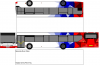
Very disappointed with the new livery. I'm sure Best Impressions or someone can do something MUCH better?
(This livery (designed by me) would work much better imho)
It's a bit white.. Needs another colour
Jordan Adam
Established Member
Very disappointed with the new livery. I'm sure Best Impressions or someone can do something MUCH better?
(This livery (designed by me) would work much better imho)
Works better until you need to replace a panel!

Bus Lightyear
Member
- Joined
- 16 Nov 2018
- Messages
- 542
Looks more like an National Express liveryVery disappointed with the new livery. I'm sure Best Impressions or someone can do something MUCH better?
(This livery (designed by me) would work much better imho)
Rod Harrison
Member
- Joined
- 15 Oct 2017
- Messages
- 121
The Beachball is a very recognisable livery which is relatively highly regarded when brand surveys are done. Why change a winning one especially with such a nondescript one? All rather pointless. It is the best of the big 3 and Go Ahead don’t have a corporate livery and Transdev seems to have a livery to any bus that turns right instead of left at the traffic lights!Looks more like an National Express livery
GaryMcEwan
Established Member
Very disappointed with the new livery. I'm sure Best Impressions or someone can do something MUCH better?
(This livery (designed by me) would work much better imho)
Why would yours work 'So much better'? Interested to hear your thoughts on this...
Jordan Adam
Established Member
The Beachball is a very recognisable livery which is relatively highly regarded when brand surveys are done. Why change a winning one especially with such a nondescript one? All rather pointless. It is the best of the big 3 and Go Ahead don’t have a corporate livery and Transdev seems to have a livery to any bus that turns right instead of left at the traffic lights!
Beachball is outdated and in dire need of an update. All they really need to do is come up with a scheme that works today while still retaining that Stagecoach look/feel to it. When it comes to liveries Go Ahead are just a mess, even the new GNW livery was a blatant copy of Transdevs POTN.
Last edited by a moderator:
That's the problem with most liveries (Stagecoach Gold in particular!)Works better until you need to replace a panel!
It's distinctive, recognizable and anyway the new Stagecoach livery looks too much like Arriva's!Why would yours work 'So much better'? Interested to hear your thoughts on this...
Speaking of which, perhaps Stagecoach is trying to save money on repaint costs when they take over parts of Arriva's UK operations?

I really like Go-Ahead's liveries...no corporate identity for the whole country but localised liveries made to suit the area served. I wouldn't mind a bit if Stagecoach did something similar.Beachball is outdated and in dire need of an update. All they really need to do is come up with a scheme that works today while still retaining that Stagecoach look/feel to it. When it comes to liveries Go Ahead are just a mess, even the new GNW livery was a blatant copy of Transdevs POTN. Speaking of which the reason Transdev have so many liveries is because every time a Transdev vehicle breaks down they have to repaint it a different colour.....
- Status
- Not open for further replies.