pdeaves
Established Member
Quite possibly the most idiotically dangerous post of recent times.
In fairness, it's a change that would (in the poster's opinion) make the liveries look nicer, not necessarily make them safer/appropriate/acceptable.

Quite possibly the most idiotically dangerous post of recent times.

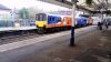
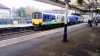
Looks kind of odd on the 150. But a good job all round.
What do you think most (non-enthusiast) travellers want? Pretty colours, or a co-ordinated network that runs on time, where you can understand the fares structure and where conections are protected if things are going wrong?
Quite. I like their solution (ok, actually I’m being sarcastic) to the Virgin red on the roof. Just don’t wash them, as the exhaust and whatever else dirt is similar in colour to the XC livery.


Personally i would paint everything Rail Freight Coal.
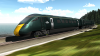
I’ve seen a livery mock up on the internet before - it was of a FGW HST with the same livery style, except the body was in midnight blue, and the dynamic lines were in shades of yellows and oranges. It looked lovely, though I can no longer find the image.
 First Great Western Sunset HST by Paul Burkitt-Gray, on Flickr
I thougt this is a thread for Slight changes you would make to liveries to make them nicer and not Bring back GNER...I'd modify the current VTEC one thus:
Remove the red except for a waist stripe.
Change all the white for a glossy Navy blue.
Change the V and T for a G and N.
Change the C for a R

I'm not totally sure about what, but were I in charge ALL rolling stock would be a single dignified colour (navy, dark green, maroon, black) across the whole of England and I'd allow modest, tasteful vinyl branding in Gill Sans with a single logo per carriage/loco side.
Exactly. Imagine the confusion caused.Thankfully you're not!

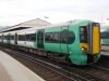
I do agree that their bus liveries have a lot to be desired compared to their train liveries. IMO the dynamic lines on the TPE 350's was the best version.The Dynamic Lines livery is an interesting one. Personally I think the original is the nicest livery ever seen on the railway, and it's a real shame First went for a horrid washed out white based one on buses.
I found something similar, but the body is in black rather than midnight blue
Here's another one.
View attachment 39824
(based off Mike McDermott's image on Flickr) - all credit to him for the original
Here's another one.
View attachment 39824
(based off Mike McDermott's image on Flickr) - all credit to him for the original
Could you (or someone) point out the change on this, please? Extending the light green further back? Thanks!
member: 51336" said:Exactly. Imagine the confusion caused.
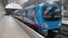
I think they suffered from "we have space left what to do?"Straight away i would remove the various coloured dotted 'n' logos on each end of the new northern livery. To me it screams late 90's / early 00's. Without them the livery looks instantly smarter and has a standardised blue 'n' logo making the whole marketing and branding much simpler.
On me, suggesting a single country wide livery:
We did manage when a single company ran all the trains with the same livery and we avoided the need to repaint in a rush at franchise changes.
GWR Green, lovely, but what's the point of that matte stripe? Take it away!