
-
Our new ticketing site is now live! Using either this or the original site (both powered by TrainSplit) helps support the running of the forum with every ticket purchase! Find out more and ask any questions/give us feedback in this thread!
You are using an out of date browser. It may not display this or other websites correctly.
You should upgrade or use an alternative browser.
You should upgrade or use an alternative browser.
Stations rebranded to Great British Railways design / Rail Alphabet 2 & 3
- Thread starter JaJaWa
- Start date
Sponsor Post - registered members do not see these adverts; click here to register, or click here to log in
R
RailUK Forums

I didn’t manage to take a picture as I was on a passing train but I believe that Elstree & Borehamwood has new RA3 signage on its platforms (seen from the curl on the l at the bottom).
Though still boring, it does look a lot better than the current version in the standard with thicker arrows and dividers on some of the signs.
Though still boring, it does look a lot better than the current version in the standard with thicker arrows and dividers on some of the signs.

Leyland Bus
Established Member
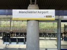
RA3 in a heavier weight aswell... At this point, what was the need to create a new typeface when it's more or less what Rail Alphabet was in the first place?New RA2 with Bee network branding at Manchester Airport
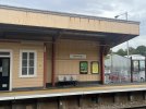
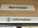
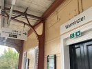
Warminster station has had its signage updated. It was previously in First Great Western branding.
I think it looks quite smart and clean in this location.
I think it looks quite smart and clean in this location.
Attachments


More photos here. Shows off the new style signage well including what seems to be a new icon set:New RA2 with Bee network branding at Manchester Airport
https://transportsigns.co.uk/project/manchester-airport-wayfinding-upgrade/


Yes this is the latest “GBR Proper” / Rail Alphabet 3 design also seen at Cambridge South.More photos here. Shows off the new style signage well including what seems to be a new icon set:
https://transportsigns.co.uk/project/manchester-airport-wayfinding-upgrade/
Personally, I don’t like it. The bolder font is one thing, but the symbols, box around them, and 1980s style small thick arrows are a massive downgrade IMO.

pr1
Member
I'll admit to being baffled by RA3 essentially returning to the very arrows they said at the start of all this required replacing with the thinner alternatives!Yes this is the latest “GBR Proper” / Rail Alphabet 3 design also seen at Cambridge South.
Personally, I don’t like it. The bolder font is one thing, but the symbols, box around them, and 1980s style small thick arrows are a massive downgrade IMO.

TT-ONR-NRN
Veteran Member
I think those Warminster signs above look really nice.
== Doublepost prevention - post automatically merged: ==
== Doublepost prevention - post automatically merged: ==
Yes the boxes are just awful.Yes this is the latest “GBR Proper” / Rail Alphabet 3 design also seen at Cambridge South.
Personally, I don’t like it. The bolder font is one thing, but the symbols, box around them, and 1980s style small thick arrows are a massive downgrade IMO.
I think those Warminster signs above look really nice.
Not convinced about all the signs, especially the ones on the side of the building that have no border and no feeling of authority. They look like the sort of sign you'd expect if someone in an office had to quickly produce something in Word and print it out and laminate - just bigger.
If you had all these plain white boards with plain black text telling you things, it begins to feel like when Roddy Piper put on a dodgy pair of specs in They Live!
Notice how the no smoking/vaping sign has a border at the very least. It's a bit worn out in comparison, but your eyes are drawn to the message and don't drift away (yes, borders do make your eyes stay within their bounds).
Bletchleyite
Veteran Member
Yes this is the latest “GBR Proper” / Rail Alphabet 3 design also seen at Cambridge South.
Personally, I don’t like it. The bolder font is one thing, but the symbols, box around them, and 1980s style small thick arrows are a massive downgrade IMO.
It's basically the RA1 symbols with the RA3 font, isn't it? Looks a heck of a lot less clumsy than the RA3 symbols, though I still don't like any of it really.
The only RA2/3 implementation I have seen that I like is the white-on-black backlit implementation at New St.
py_megapixel
Established Member
Why on earth is wayfinding signage being done by outsourcing individual stations to external consultancies?
Doesn't sound like a recipe for consistency to me...
It's not even like they've done a particularly good job. I particularly like how "Male toilet" and "Accessible toilet" are formatted completely differently on the same sign.
In any case if the station is Bee Network branded surely the signs should be in TfGM house style and not Rail Alphabet 1, 2 nor 3?
Doesn't sound like a recipe for consistency to me...
It's not even like they've done a particularly good job. I particularly like how "Male toilet" and "Accessible toilet" are formatted completely differently on the same sign.
In any case if the station is Bee Network branded surely the signs should be in TfGM house style and not Rail Alphabet 1, 2 nor 3?
I think those Warminster signs above look really nice.
== Doublepost prevention - post automatically merged: ==
Yes the boxes are just awful.
The Warminster signs are pretty much what GWR have been quietly rolling out for the last few years, following the (now apparently obsolete) Wayfinding standard, but they've left off the GWR stripe that they used to add to name plates. Here's a selection. GWR have actually done what they should: replaced the signs rather than using stickers and followed the standard (apart from the stripe). It was looking pretty good when it was being done (mostly) properly.


Bear in mind that down here in GWR land both Wales & West/Wessex and FGW stuck with the BR standard so (a) almost all our signs were RA1 until about 10 years ago anyway (and some still are) and (b) we've had black-on-white signs down here since BR (except for a very few blue on white), so they don't look out of place here.
As for https://transportsigns.co.uk/project/manchester-airport-wayfinding-upgrade/ I can forgive the borders round the icons if they were to allow all the icons that are of different widths to take up the same space on the sign, but that only makes sense if they are aligned to the right or left rather than bunched with the text. And shouldn't the aeroplane always be pointing in the same direction as the arrow?
pr1
Member
I know we've covered this before, it's just it seems that since the advent of RA1 and the new wayfinding guidelines, the updates have been implemented at different times. It seems that there is an inconsistency across the network, and the whole point was to remove inconsistency (the narrow arrows are at Preston, but not at Manchester Airport, eg)Why on earth is wayfinding signage being done by outsourcing individual stations to external consultancies?
Doesn't sound like a recipe for consistency to me...
It's not even like they've done a particularly good job. I particularly like how "Male toilet" and "Accessible toilet" are formatted completely differently on the same sign.
In any case if the station is Bee Network branded surely the signs should be in TfGM house style and not Rail Alphabet 1, 2 nor 3?
It's not even clear if the direction to the accessible WC is only for men or not:It's not even like they've done a particularly good job. I particularly like how "Male toilet" and "Accessible toilet" are formatted completely differently on the same sign.

The top sign suggests that the 'Male' WC has an accessible facility, the second suggests a separate accessible WC that is not necessarily only 'male'.
It's not even clear if the direction to the accessible WC is only for men or not:
View attachment 213354
The top sign suggests that the 'Male' WC has an accessible facility, the second suggests a separate accessible WC that is not necessarily only 'male'.
On the top image, there was plenty of room to have the accessible toilet underneath, like the bottom image, removing any ambiguity.