• Our new ticketing site is now live! Using either this or the original site (both powered by TrainSplit) helps support the running of the forum with every ticket purchase! Find out more and ask any questions/give us feedback in this thread!

Stations rebranded to Great British Railways design / Rail Alphabet 2 & 3

Devonian

Member
Joined
10 Sep 2019
Messages
215
Location
Totnes
acres of empty white space

The wayfinding guidance actually requires less white space either side of the lettering than the old BR signage, so this sign clearly isn't right. The size of the old sign it was replacing is at odds with the size that the new sign should be. The wayfinding guidance specifies that the sign should fit the lettering: but it looks like the Southern signage has been made to a standard length for all signs, so the posts are too far apart and the new sign has to be the 'wrong' size and looks odd. That's presumably going to be a problem at all stations where signs have been fitted to two immovable posts rather than one central one.
 
Sponsor Post - registered members do not see these adverts; click here to register, or click here to log in
R

RailUK Forums

Leyland Bus

Member
Joined
20 May 2021
Messages
1,185
Location
York
The wayfinding guidance actually requires less white space either side of the lettering than the old BR signage, so this sign clearly isn't right. The size of the old sign it was replacing is at odds with the size that the new sign should be. The wayfinding guidance specifies that the sign should fit the lettering: but it looks like the Southern signage has been made to a standard length for all signs, so the posts are too far apart and the new sign has to be the 'wrong' size and looks odd. That's presumably going to be a problem at all stations where signs have been fitted to two immovable posts rather than one central one.
Yet if they dug up the posts and reset them closer together there'd be complaints of wasting money just for a sign... :rolleyes:
 

GoneSouth

Established Member
Joined
17 Dec 2018
Messages
1,474
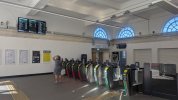
Immediately you see 2 things.

Firstly, when you look through the barriers at the old signs pointing to the platforms, they are very clear and you are able to read them easily. When you swipe to the new white version it’s absolute rubbish and you really struggle to read them

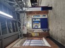
Secondly, they agreed the white sign was complete garbage and promptly installed a new sign for the ticket office in the old colours. Bigger and better than the old one, but importantly not white. It looks very good and is super easy to read.

Finally (for now) I’d say the lighting maybe brighter, but it’s aesthetically unappealing. I quite liked the look of the pendant lights.
 

vuzzeho

Member
Joined
11 Apr 2022
Messages
665
Location
London
Immediately you see 2 things.

Firstly, when you look through the barriers at the old signs pointing to the platforms, they are very clear and you are able to read them easily. When you swipe to the new white version it’s absolute rubbish and you really struggle to read them

Secondly, they agreed the white sign was complete garbage and promptly installed a new sign for the ticket office in the old colours. Bigger and better than the old one, but importantly not white. It looks very good and is super easy to read.

Finally (for now) I’d say the lighting maybe brighter, but it’s aesthetically unappealing. I quite liked the look of the pendant lights.
I know it's more of a matter of opinion, but I think your first point is more dependent on perspective and image quality. I imagine it'd look much better in person, probably equally as readable. And the other platform signs above the maps are much better now, in my opinion.

I don't understand what your second point is though. There was no white sign for the ticket office, unless I'm missing something.

Ultimately, I think it's funny that this station (which looks really good!) was redone into a brand that has about a year left. Probably not great, as it means it'll need another rebrand, but funny. And while black on white signage (if we ignore the red highlights, which I don't think we should) is a bit boring and inoffensive, I think that's the idea. When done well, it works. I feel like it's a bit extreme to call a perfectly usable, relatively inoffensive sign 'complete garbage'.
 

GoneSouth

Established Member
Joined
17 Dec 2018
Messages
1,474
I know it's more of a matter of opinion, but I think your first point is more dependent on perspective and image quality. I imagine it'd look much better in person, probably equally as readable. And the other platform signs above the maps are much better now, in my opinion.

I don't understand what your second point is though. There was no white sign for the ticket office, unless I'm missing something.

Ultimately, I think it's funny that this station (which looks really good!) was redone into a brand that has about a year left. Probably not great, as it means it'll need another rebrand, but funny. And while black on white signage (if we ignore the red highlights, which I don't think we should) is a bit boring and inoffensive, I think that's the idea. When done well, it works. I feel like it's a bit extreme to call a perfectly usable, relatively inoffensive sign 'complete garbage'.
I meant after trying white on the platform side they realised it was a terrible idea and went back to using colour, replacing the old coloured ticket office sign with a much bigger and better looking one. You’re right, there wasn’t a white sign for the ticket office.
 

traji00

Member
Joined
17 Aug 2009
Messages
241
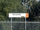
Berrylands platform 1 has new signage as part of its platform rebuild. I couldn’t get a picture in time but to summarise :

Station name is black (possibly RA3) a white background of course.
Unlike at Gipsy Hill though, The fare zone “square” is retained as black text on orange.

(on the country end, the existing SWT-era signage currently remains in two places.)
 
Last edited:

greaterwest

Established Member
Joined
23 Nov 2014
Messages
1,612
Berrylands platform 1 has new signage as part of its platform rebuild. I couldn’t get a picture in time but to summarise :

Station name is black (possibly RA3) a white background of course.
Unlike at Gipsy Hill though, The fare zone “square” is retained as black text on orange.

(on the country end, the existing SWT-era signage currently remains in two places.)
This is a shame IMO, as SWT / SWR's network has one of the most coherent wayfinding designs on the entire network.

As much as I like RA2 / RA3 when applied properly, I think they were wrong to re-do Berrylands here.
 

traji00

Member
Joined
17 Aug 2009
Messages
241
Here is Berrylands.
On closer inspection it appears the “Fare Zone 5” font is the same as the incumbent SWT/SWR signage.
Another variation :rolleyes:
 

Attachments

  • IMG_7177.jpeg
    IMG_7177.jpeg
    1 MB · Views: 240
Last edited:

Leyland Bus

Member
Joined
20 May 2021
Messages
1,185
Location
York
Here is Berrylands.
On closer inspection it appears the “Fare Zone 5” font is the same as the incumbent SWT/SWR signage.
That is definetly RA3 and is a heavier weight than previous iterations using RA2.

It'll look well if the Fare Zones are ever abolished :rolleyes:
 

GoneSouth

Established Member
Joined
17 Dec 2018
Messages
1,474
Here is Berrylands.
On closer inspection it appears the “Fare Zone 5” font is the same as the incumbent SWT/SWR signage.
Another variation :rolleyes:
I’ll concede the font is a little heavier which helps, as does a splash of colour. Font size could be bigger though!
 

JaJaWa

Established Member
Joined
14 Feb 2013
Messages
1,730
Location
Firstly, when you look through the barriers at the old signs pointing to the platforms, they are very clear and you are able to read them easily. When you swipe to the new white version it’s absolute rubbish and you really struggle to read them...
Interestingly, I find the dark sign sticks out more initially, but the white one is far more readable when you are more zoomed in (or closer to both). I guess they could solve this by using a darker wall colouring around the signs.


And while black on white signage (if we ignore the red highlights, which I don't think we should)...
Noticed Exeter Central is using black (G)BR double arrows for Platforms when it should be red double arrows (RA2) or a black train symbol (RA3)...

Source: https://x.com/lokiavivson/status/2087083987558662280
 

Attachments

  • IMG_1625.JPG
    IMG_1625.JPG
    351.7 KB · Views: 149

JaJaWa

Established Member
Joined
14 Feb 2013
Messages
1,730
Location
I love the fact this forum has just collectively adopted the term "RA3" for RA2 in bold :lol:
RA3 is a new font and there are various other differences on the signs at Cambridge South too (symbols in boxes, different symbols, thicker arrows, one arrow per line à la RA1 signs rather than one arrow per group with RA2 signs).

This come up on a quick search but I’ve read other posts about it too:
The lettering isn’t even set in Rail Alphabet 2, the new typeface commissioned by Network Rail a few years ago and designed by typeface experts Margaret Calvert and Henrik Kubel specifically for the British rail network (thank you to one of my correspondents for pointing this out). All the “coming soon” versions of the GBR logotype used Rail Alphabet 2, but now it has morphed into some new variant. The lower case ‘l’ now has a hook while the upper case ‘R’ has a straight leg instead of a slightly curved one – the latter change so subtle it seems hardly worth the effot. Whispers in the industry suggest this modified typeface is called Rail Alphabet 3. But imagine having all the expertise that went into Rail Alphabet 2 and then the DfT just deciding on a whim that it wants a new variant. It’s the start of slippery slope in which the client starts requesting more and more changes, believing it knows more about typeface design than experienced typeface designers. The typeface drifts further and further from the purity of its original concept. How many more Rail Alphabets are there to come?
Source: https://thebeautyoftransport.com/2025/12/22/union-flag-blues-the-branding-of-great-british-railways/
 

TT-ONR-NRN

Veteran Member
Joined
30 Dec 2016
Messages
12,773
Location
Worcester

Leyland Bus

Member
Joined
20 May 2021
Messages
1,185
Location
York
How interesting, thank you for this.
"Tweaked" for legibility and accessibility reasons apparently (despite RA2 being designed especially for that reason and why they didn't refer back to Rail Alphabet in the first place). There were heavier weights of RA2 though they were seldom used...
 

150219

Member
Joined
24 Nov 2009
Messages
471
An RA2 sign at one of the entrances to High Wycombe nicely hidden by the canopy arch...
That's Akzidenz Grotesk and the kiosk sign is Gotham.

There are however some new RA signs appearing on the Chiltern managed stations, e.g., Monks Risborough, Haddenham, Denham Golf Club (black/white signs) and Warwick Parkway.
 

Vexed

Member
Joined
12 Jan 2020
Messages
642
Location
Herts / Hants
I stand corrected. I saw the new (is it even a new design?) icon for the tickets icon and assumed it would be RA2.

The sign saying kiosk is definitely older and still has Chiltern colours.
 

pr1

Member
Joined
6 Feb 2026
Messages
72
Location
Preston, Lancashire
I stand corrected. I saw the new (is it even a new design?) icon for the tickets icon and assumed it would be RA2.

The sign saying kiosk is definitely older and still has Chiltern colours.
The differences are subtle and clear in almost equal measure, that's sans-serief typefaces for you!

Attached images show examples of the two typefaces in question. Differences include overall style of lower-case 'a', height of the lower-case 'd', and curves of upper-case "B"


150219

Member
Joined
24 Nov 2009
Messages
471
I stand corrected. I saw the new (is it even a new design?) icon for the tickets icon and assumed it would be RA2.

The sign saying kiosk is definitely older and still has Chiltern colours.
It's the other way around. The Akzidenz Grotesk sign predates the kiosk sign. The Gotham signage is reasonably new. The blue High Wycombe cut out letters were in the early 2000's style, which was in a different weight of lettering to the original.
 

Top