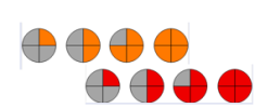
I like that - simpler and gets across the risks better. But would still get rid of the yellows, and just allow forecasters to mention this stuff in the usual verbal forecast descriptions ('quite a wet day tomorrow with lots of road spray' etc). You could even overlap the orange and red rows, so as to indicate the relative seriousness, maybe...I suggested the following a few years ago, as most people understand the concept of pie charts...
View attachment 206590
The symbols could be used on all maps and forecasts, but they (MetO) seem very invested in the current system and fail to see its shortcomings. In reality you would probably only use the two highest Yellow symbols.
Bottom line, I still would leave the single sector oranges and reds to verbal mentions. Until the likelihood reaches 50% say, then you 'go formal'. To avoid crying wolf.