Can you re-do those pictures without the red swoop sloping down the carriage ? It would look a lot better ?I put together a few variations (by hand with Pixelmator! No AI rubbish used) with the yellow nose panel changed to match the rest of the livery, and it looks far, far better with the dark blue or Hull Trains-style black, much like the Amtrak locomotive on the last page.

-
Our new ticketing site is now live! Using either this or the original site (both powered by TrainSplit) helps support the running of the forum with every ticket purchase! Find out more and ask any questions/give us feedback in this thread!
You are using an out of date browser. It may not display this or other websites correctly.
You should upgrade or use an alternative browser.
You should upgrade or use an alternative browser.
Great British Railways livery: Alternative suggestions/variations
- Thread starter Rab Smith
- Start date
Sponsor Post - registered members do not see these adverts; click here to register, or click here to log in
R
RailUK Forums

occone
Member
This is classy!An example of a ' class 800 in red white and blue livery" I just did.
Needs some work but better than what was presented
Edit: see my avatar pic too
Having had a day to think about it, I wonder if the livery needed to be punchy for the press release and they'll refine it out later on.
I quite like the red stripe behind the double-arrows logo - it's a bit GWR inspired. The rest is too cluttered and Poundland TPE, I feel if they got a proper design firm in some of the proportions could be tweaked and refined out

Agent_Squash
Established Member
- Joined
- 22 Jul 2016
- Messages
- 1,271
They should’ve taken the old Stagecoach SWT livery and modernised it.
It would’ve been perfect, and pleased the flag lovers.
It would’ve been perfect, and pleased the flag lovers.
PLY2AYS
Member
Had another play about so the logo for Great British Railways was current.
(photo includes edit of previously posted mock up of Great British Railway colours based on an LNER Class 80x Azuma livery with Great British Railways text and logo instead of LNER)
(photo includes edit of previously posted mock up of Great British Railway colours based on an LNER Class 80x Azuma livery with Great British Railways text and logo instead of LNER)
Attachments
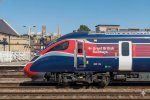
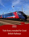
Even better, just reuse the LNER livery but replace the silver stripe with a blue one. It really does seem that simple but that would be so much more effective, and the LNER method of doing things still allows for those special liveries like they do now to work while still looking uniform. Doing so would also have emphasised naturally more on the red part as this is after all really just a primarily England-minded repaint.An example of a ' class 800 in red white and blue livery" I just did.
Needs some work but better than what was presented
Edit: see my avatar pic too
1 poor photoshop later...

Last edited:

Chiltern006
Member
- Joined
- 3 Oct 2018
- Messages
- 809


Turtle
Member
- Joined
- 18 Mar 2013
- Messages
- 468
No. We've got to get away from these grubby white/insipid grey liveries. Also, they attract graffiti vandals.Could you please send this to the UK Department for Transport with the suggestion that they use this instead of their current proposed branding. This is infinitely better.
Honestly, I cannot decide which looks better here. I do like my dark liveries (in general the GBR livery does great in regards to not being an assault of white), but I also like that splash of yellow.Quick 5 minute photoshop and I can’t help (on the IETs anyway) that a black front works significantly better
A random thought when it came to the 5 coach layout of the design images, this was kinda a great opportunity to link together with nothing but a flat colour in the middle coach between the other coaches. Some designs in the NL in particular for the GTW/WINK are done this way


Icon from Arthur's Treinenpagina
All they could've done is just leave that middle coach dark blue, and then the repeating pattern would have made sense.

MargaretNoodle
Member
I think my issue with it is the blue colour dominating, although perhaps I'm in a minority there. Anyway, here is my bash at it, with the door and body colour reversed plus some APT style yellow at the front which I couldn't resist.
Chiltern006
Member
- Joined
- 3 Oct 2018
- Messages
- 809
I like that however I think the yellow is a tad excessive. I would have kept the yellow as is currently on the stock and the excess as white. Other than that it’s really nice. Sometimes simple is just bestI think my issue with it is the blue colour dominating, although perhaps I'm in a minority there. Anyway, here is my bash at it, with the door and body colour reversed plus some APT style yellow at the front which I couldn't resist.View attachment 193600

Had a little play around with some previous or existing liveries to incorporate the red, white and blue of the Union Jack but with a little more subtlety. It's mostly just modifications of the current Northern livery and the old South West Trains express and Virgin Trains silver and red liveries. Forgive the blurry text on some of the smaller ones, and also for not colouring the full sets. I'd be open to some feedback and suggestions for change as well.
Attachments





Maltazer
Member
- Joined
- 7 Feb 2019
- Messages
- 88
I just got back from a trip to Belgium, where trains are in a mostly white livery with red and blue accents. They all look grubby and unappealing, and no amount of scrubbing removes the graffiti stains from the white parts.
Also considering GBR is more like a GER, with Scotrail and TFW remaining devolved, why the urge to base anything on the union flag? (Unless the blue is actually a nod to the GER of old!)
Also considering GBR is more like a GER, with Scotrail and TFW remaining devolved, why the urge to base anything on the union flag? (Unless the blue is actually a nod to the GER of old!)

I am a staunch yellow panel supporter even if it doesn't fit the livery.I put together a few variations (by hand with Pixelmator! No AI rubbish used) with the yellow nose panel changed to match the rest of the livery, and it looks far, far better with the dark blue or Hull Trains-style black, much like the Amtrak locomotive on the last page.
PLY2AYS
Member
These are really good!Had a little play around with some previous or existing liveries to incorporate the red, white and blue of the Union Jack but with a little more subtlety. It's mostly just modifications of the current Northern livery and the old South West Trains express and Virgin Trains silver and red liveries. Forgive the blurry text on some of the smaller ones, and also for not colouring the full sets. I'd be open to some feedback and suggestions for change as well.
Cardiff123
Established Member
The brand name "Rail Britain" or "Rail England" would've been a much better name, or even better, just keep the existing franchise / regional identities under government ownership.
But since 2016 everything has had to be "Great Britain" and "world beating" etc.......
But since 2016 everything has had to be "Great Britain" and "world beating" etc.......

SoloSR334022
Member


5 mins in the A.I, and I think these all better than what they came up with.
Yeah SNCB dont do a good job with maintaining their white... I tend much prefer a dark but colourful livery with a splash of white as opposed to tons of white.I just got back from a trip to Belgium, where trains are in a mostly white livery with red and blue accents. They all look grubby and unappealing, and no amount of scrubbing removes the graffiti stains from the white parts.
Also considering GBR is more like a GER, with Scotrail and TFW remaining devolved, why the urge to base anything on the union flag? (Unless the blue is actually a nod to the GER of old!)
Youre correct on the branding too, aside from trains that cross the Welsh/Scottish borders this is primarily just a England livery affair. It kinda comes off as very 'we are better than you' to the Welsh and Scottish which have much better and well designed branding packages.
== Doublepost prevention - post automatically merged: ==
I will add to this the 158903 adapted design I did from the other thread.
View attachment 193538
Also, for fun, I wrapped the windows in a white bar; it looks like the back half is reminiscent of BR, while the front half is new. Either way, it is really not bad for what it was, about I dont know 20 minutes of time?
I dont know about the whole 'separation between Intercity and Local', part of me would not mind a fully unified livery across all sectors like ScotRail, but I would be open to an idea of having two separate liveries. However, obviously, the DfT has not made any mention of there being separate ones thus far. I think a livery featuring a full-length stripe, like the good old intercity days, would much better suit an intercity service if there was to be a separation of sorts. Even then, it has already been made in the form of the LNER's 91 livery, just tweak that as far as I am concerned.
== Doublepost prevention - post automatically merged: ==

Playing around with what I can come up with. I am stuck between if we should really be going blue, red and white or not. Part of me would like to imagine a white/red livery that is visually distinct from TfW, but I feel like one of the only reasons to use the red, white and blue is to differ from TfW who have kind of stolen the white and red already.
My only other idea was swapping out the red for a lighter blue and opting for a blue/white livery, which while less 'great british railways' would be very at least visually distinct from ScotRail and TfW. I actually think this could look very close to a modern interpretation of the regional railways look if you think about it.

I don't personally like going straight from red into dark blue either, I see it as a really harsh transition, which is why I wanted to use something neutral in-between.
However when it comes to Intercity trains I would always want a much more 'executive' style with less colour, a modern version of swallow perhaps, I think taking the LNER 91 as a base and going from there would be more than acceptable.
Last edited:
Smwrff
Member
I always felt that Rail Wales would have been a better name for TfW Rail (the Operator as opposed to the WG department with same name (TfW)), it is a word play on Railways... and grammatically correct in Welsh.The brand name "Rail Britain" or "Rail England" would've been a much better name, or even better, just keep the existing franchise / regional identities under government ownership.
But since 2016 everything has had to be "Great Britain" and "world beating" etc.......
Well thank you!These are really good!

I really love both of the designs here, especially the first one. It's very Union Jack, more so than mine, but still subtle enough that it isn't proper in your face. I'd love to see what you'd come up for an InterCity livery!View attachment 193617
Playing around with what I can come up with. I am stuck between if we should really be going blue, red and white or not. Part of me would like to imagine a white/red livery that is visually distinct from TfW, but I feel like one of the only reasons to use the red, white and blue is to differ from TfW who have kind of stolen the white and red already.
My only other idea was swapping out the red for a lighter blue and opting for a blue/white livery, which while less 'great british railways' would be very at least visually distinct from ScotRail and TfW. I actually think this could look very close to a modern interpretation of the regional railways look if you think about it.
View attachment 193618
I don't personally like going straight from red into dark blue either, I see it as a really harsh transition, which is why I wanted to use something neutral in-between.
However when it comes to Intercity trains I would always want a much more 'executive' style with less colour, a modern version of swallow perhaps, I think taking the LNER 91 as a base and going from there would be more than acceptable.

brad465
Veteran Member
Let's hope they don't go for this look with the uniforms doing the rounds on social media:

(AI Image of three staff in attire with a similar blue, red and white scheme to the GBR train livery)
(AI Image of three staff in attire with a similar blue, red and white scheme to the GBR train livery)
I mean in retrospect ours are similarWell thank you!
I really love both of the designs here, especially the first one. It's very Union Jack, more so than mine, but still subtle enough that it isn't proper in your face. I'd love to see what you'd come up for an InterCity livery!
, I wanted to stick with the more angular design, but cutting out that 'in your face aspect' as we saw from the GBR design. The white offset at the bottom being wider towards the vestibule, started as just trying to draw an odd white line as a detail but then I decided I would fill it in and make it a pattern, which could also flow very nicely into the next carriage. An ongoing pattern of sorts is something I enjoy, such as how the VTEC 91 livery framed each coach with the red flow pattern.I might be talking utter rubbish, but you could easily sub out these colours in this pattern to make regional variations.

I put the GBR text in the larger white space towards the vestibule, and any other local region logos can go in the other spaces (this may vary per train). This might be similar to how German trains often carry the local region logo in addition to the DB logo somewhere along the sides of the train. In the original Union Jack idea, the text and/or logo would go in the middle of the train, but either is an option depending on personal preference, I much prefer putting it towards the end of each coach rather than in the middle like TfW does.

^ (This would also be a good contender for a purely English-based livery I guess)

(I dont know what this colour might be for, I would say GWR but I like the GWR livery as is, maybe this is an instance where you could replace the white with more green much like the existing livery.
I think Intercity would definitely, from a consistency standpoint not be too radically different and yet more 'upmarket' so to speak, the redesigned swallow with tweaks would be perfect. It is difficult to put it onto an IET though due to the IET's curvy nature at the front. My first thought was something along the lines of what Eurostar did with the 373's/374's.
Last edited:
Yours is definitely an improvement. To simplify it, I'd dispense with the one on the front (extend the yellow to cover it) and move the bosyside ones forward such that you're left with a red/white/blue arrow. Gives a feeling of speed.Fair play to the Government for not wasting oodles of taxpayers cash employing a design firm.
I mean, if I can knock this design up in 2 minutes then anyone is a design consultant.
This has got a bit of everything for everybody
I hate Avanti's livery for the same reason. I've come up with a design principle for liveries: lines (except for contrasting doors) should never be steeper than the cab front.This does not work due to the ‘choppy’ design going through the length of the train. They should have adapted the LNER design that ‘flows' the length of the train with the front emphasising speed. All they needed to do would be add a blue line - in one shade. I also don’t like the white ‘eye’ around the small side window on the cab. LNER do it much better with black around this small window.
They ought to crowdsource it.In view of all these negative comments, I think they should go back to the drawing board.
On 158s in summer you really want a white livery, trust me!No. We've got to get away from these grubby white/insipid grey liveries. Also, they attract graffiti vandals.
I would much prefer 'Rail England' if we really can no longer have British Rail anymore. Besides, it probably better suits the fact that this is purely an England rebrand as TfW and SR are staying.The brand name "Rail Britain" or "Rail England" would've been a much better name, or even better, just keep the existing franchise / regional identities under government ownership.
But since 2016 everything has had to be "Great Britain" and "world beating" etc.......
Mike Machin
Member
- Joined
- 19 Aug 2017
- Messages
- 384
Well, I have spent part of every year in Norway since 1982. Despite Norway’s national colours being red, white and blue, the Norwegian national train operator has recently re-launched and re-branded their passenger train services as ‘Vy’ - meaning view, featuring a beautiful semi-metallic darkish teal green.What else could we have as a national livery if not red, white and blue?
I wouldn't say no to British Racing Green, to be honest.
With beautiful minimalist typography, and a thoughtfully executed interior refresh with carefully chosen colour-coordinated the result is professional, has gravitas and creates a wonderful travelling environment.
Bletchleyite
Veteran Member
Well, I have spent part of every year in Norway since 1982. Despite Norway’s national colours being red, white and blue, the Norwegian national train operator has recently re-launched and re-branded their passenger train services as ‘Vy’ - meaning view, featuring a beautiful semi-metallic darkish teal green.
With beautiful minimalist typography, and a thoughtfully executed interior refresh with carefully chosen colour-coordinated the result is professional, has gravitas and creates a wonderful travelling environment.
I'd agree that's a particularly impressive user experience package - and it is that, not just a brand. Would be great to see GBR doing something like that but I doubt they will.

TT-ONR-NRN
Veteran Member
I don't understand the need to have the random blue at the cab area of the livery. Where the flag swooshes come together and all naturally move to a red area, it should then surely stay red for the final couple metres until the end of the train.Quick 5 minute photoshop and I can’t help (on the IETs anyway) that a black front works significantly better
== Doublepost prevention - post automatically merged: ==
The yellow is horrendous but that could be good if the yellow was replaced by blue.I think my issue with it is the blue colour dominating, although perhaps I'm in a minority there. Anyway, here is my bash at it, with the door and body colour reversed plus some APT style yellow at the front which I couldn't resist.View attachment 193600

Mgameing123
Member
I’d go for a design that would be a modified version of the BR liveries to reflect history and be modern.

These are amazing! Excellent work.Had a little play around with some previous or existing liveries to incorporate the red, white and blue of the Union Jack but with a little more subtlety. It's mostly just modifications of the current Northern livery and the old South West Trains express and Virgin Trains silver and red liveries. Forgive the blurry text on some of the smaller ones, and also for not colouring the full sets. I'd be open to some feedback and suggestions for change as well.
Can you produce some versions where the white and blue are swapped?