• Our new ticketing site is now live! Using either this or the original site (both powered by TrainSplit) helps support the running of the forum with every ticket purchase! Find out more and ask any questions/give us feedback in this thread!

Great British Railways: Station identity and livery unveiling (09/12/25)

Status
Not open for further replies.

PLY2AYS

Member
Joined
26 Mar 2024
Messages
518
Location
Montserrat
It looks nice for sure, definitely more understated and premium. I wonder if you could do a version with the double-arrow instead of the GBR?

I personally would put the wording INTERCITY or GBR INTERCITY underneath the white line in the center of the coaches (either all of them or driving coaches only). And make that white line a bit thicker. There needs to be some brand differentiation. Would work well in that light font with some spacing between the letters.
Been split to the Speculative Threads section now!

 
Sponsor Post - registered members do not see these adverts; click here to register, or click here to log in
R

RailUK Forums

Noddy

Established Member
Joined
11 Oct 2014
Messages
1,654
Location
UK
As a fully paid-up member of the tofu-eating wokerati, I think that the way you take the sting out of the right-wing use of flags is for everyone else to use them more.

Totally agree with this point. The best way we can react to this co-opting of not just the Union Jack but also more recently the Scottish and Welsh flags by the far right is to make them unrepresentative of the far right.
 

renegademaster

Established Member
Joined
22 Jun 2023
Messages
2,218
Location
Croydon
That livery is dire. Why also does it have to be GREAT British Railways? It sounds either like the misplaced belief that the Great in Great Britain refers to its status (which is what the Tories and the far right would have you think) or a TV programme that Michael Portillo would host.
It's tacky, tasteless and moronic.
It's called Great British Rail Railways because they are desperately trying to avoid reviving British Rail as a brand, as most people don't actually remember it fondly and remember the last 20 year or so by best
 

Mike Machin

Member
Joined
19 Aug 2017
Messages
383
Well, my first impression last night when viewing on my phone was 'oh my goodness, what have they done!' I'm a partner in a graphic design consultancy so we have all been looking at it on our big desktop iMacs this morning and it doesn't look too bad. We think it will certainly achieve what the government has set out to do, that is, create a big impression of change. It will probably look a bit kore subtle 'in the metal in 3-D' under different lighting conditions. On the 800 Series unit image they've used for their media launch, our main down-tick comment is get rid of the white area around the cabside window.

I'm sure it will evolve as time goes on and I can still remember the horror from most enthusiasts when they first encountered Network SouthEast. Let's see how it goes...
 

bramling

Veteran Member
Joined
5 Mar 2012
Messages
20,402
Location
Hertfordshire / Teesdale
Rather puzzled at those complaining of the use of Union flag colours. Only in the UK would anyone have a problem with their own country's flag. Other countries use them without comment,

I don’t think people have a problem with flags being used per-se. However flags are suited to being mounted atop poles, not on vinyls stuck to train bodies.

If people want the railway to display a flag, I’d prefer they put a proper flag on top of every station building and had a more mature livery.

I’ve never been keen on the ScotRail livery for the same reason.
 

Northerngirl

Member
Joined
16 Aug 2023
Messages
514
Location
Wirral
Well, my first impression last night when viewing on my phone was 'oh my goodness, what have they done!' I'm a partner in a graphic design consultancy so we have all been looking at it on our big desktop iMacs this morning and it doesn't look too bad. We think it will certainly achieve what the government has set out to do, that is, create a big impression of change. It will probably look a bit kore subtle 'in the metal in 3-D' under different lighting conditions. On the 800 Series unit image they've used for their media launch, our main down-tick comment is get rid of the white area around the cabside window.

I'm sure it will evolve as time goes on and I can still remember the horror from most enthusiasts when they first encountered Network SouthEast. Let's see how it goes...
Atleast nse flows, i can understand not liking it, but it does actually fit on a multi carrage train
 

bramling

Veteran Member
Joined
5 Mar 2012
Messages
20,402
Location
Hertfordshire / Teesdale
This is what I was getting at earlier.

All the people who find the national colours repellent are in a way handing them (and other symbols of national identity) to the far right to use.

Red, white and blue are generally attractive colours; contrast with the Dutch orange (I am aware it is different to their flag colours) and the depressing maroon of Qatar, for instance.

It’s quite possible to like the colours but find the livery design horrible.
 

capital12

Member
Joined
20 Aug 2012
Messages
525
I don’t mind the colours, the application less so!

As others have said, certainly having the centre coaches more neutral would help.

I don’t get on one hand they say ‘saving money’ but then create something that uses so much vinyl it costs a fortune to apply!

A base blue livery with a flash of something at the ends would be my preference over this mess!

Also it seems to suffer from the ‘First’ disease of having logos plastered everywhere - full length ones on the side, abbreviated ones in any small space they can squeeze them (just think Avanti, SWR etc). Just the double arrow on its own at the ends would have been fine in my opinion.

It certainly needs a rethink and a bit more ‘less is more’ applied!
 
Last edited:
Joined
8 Feb 2021
Messages
1,060
Location
Manchester
I think if I used the words I want to use to describe it, I’d end up with a ban of indeterminable length. So I’ll settle to say it looks awful & amateurish.
 

6Gman

Established Member
Joined
1 May 2012
Messages
9,215
How is it going to reflect onto other train designs? It may look fine on an IET but not on a Desiro, say.
How's it going to look on a 150? ;)

Frankly, and these things are very personal and subjective, it looks to me like something worked up by a teenage enthusiast on his laptop.

Do we know the designer?
 

Wolfie

Established Member
Joined
17 Aug 2010
Messages
7,431
How's it going to look on a 150? ;)

Frankly, and these things are very personal and subjective, it looks to me like something worked up by a teenage enthusiast on his laptop.

Do we know the designer?
Stevie Wonder, methinks....
 

PLY2AYS

Member
Joined
26 Mar 2024
Messages
518
Location
Montserrat
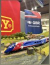
The mock up at London Bridge does look a little better.

(Image posted shows a Hornby class 800 in the new livery, possibly 00 scale, from the mock up at London Bridge station)

Credit @thattraindrivermum on Instagram.
 

Attachments

  • IMG_1868.jpeg
    IMG_1868.jpeg
    450.2 KB · Views: 381

LNW-GW Joint

Veteran Member
Joined
22 Feb 2011
Messages
21,929
Location
Mold, Clwyd
Indeed, the French are very proud of their identity yet somehow their trains aren't covered in a bastardisation of their flag :D
The French Régions are very keen to wrap their (TER) trains in local identities, typically with region names and coats of arms prominently displayed.
Similar in Germany, where the federal structure gives a strong local identity.
We still don't know how GBR will be organised (beyond Scotland, Wales, London and some other metro areas).
eg A "Birmingham" Region of GBR might well have a strong West Midlands (or possibly Mercian?) identity separate from the generic national one.
 

ricj

Member
Joined
31 May 2022
Messages
37
Location
Guisborough
Bit late to the commenting party but from what I've seen this morning, across any forum or comment section online, the feedback has been almost unanimously negative. And I agree. It's a chaotic mess and just looks like a Trans-Pennine knock off that'll look dated in a year or so (if it doesn't already).

As many others have said, if they HAVE to use that horrible union flag inspired mess, it'd be infinitely better if they restricted it to the leading vehicle on each unit and had the design morph into a clean set of lines that ran the length of the train. At least that'd give the impression of speed rather than the disjointed mess it currently is...

Hopefully the aforementioned unanimously terrible reaction will force some kind of a re-think.
 

Kite159

Veteran Member
Joined
27 Jan 2014
Messages
22,813
Location
West of Andover
...
The mock up at London Bridge does look a little better.

(Image posted shows a Hornby class 800 in the new livery, possibly 00 scale, from the mock up at London Bridge station)

Credit @thattraindrivermum on Instagram.
Interesting, they used the first class end of the train which has no windows to cut off the vinyl colours.
 

172007

Member
Joined
2 Jan 2021
Messages
1,164
Location
West Mids
Couple of things standout.

If it's a one livery fits all what happens to the corporate identity of the current regional liveries such as the West Midlands they ise a WM diamond logo and different colours for trains, buses and trams?
 

Bletchleyite

Veteran Member
Joined
20 Oct 2014
Messages
113,673
Location
"Marston Vale mafia"
Couple of things standout.

If it's a one livery fits all what happens to the corporate identity of the current regional liveries such as the West Midlands they ise a WM diamond logo and different colours for trains, buses and trams?

I would expect any devolved operation (TfW, ScotRail, Merseyrail, TfL) to be unchanged. I guess others depend on the extent of further devolution.
 

thomalex

Member
Joined
25 Aug 2021
Messages
532
Location
Leeds
From Tim Dunn - https://x.com/MrTimDunn/status/1998309821104185801/photo/3

"Yesterday I nipped over to @transportgovuk to have a look at some #GBR branding development work. What's missing from the narrative of it being touted as a "brand reveal" is that it's more of a "look and feel": it certainly hasn't been finessed creatively yet. Reading between the lines yesterday is that these concepts will be developed by a GBR brand and marketing team; but since the org doesn't yet exist, and the people haven't yet been appointed, this is a loose starting point for them to work from. It does feel like it could benefit from some further professional brand development work before it's rolled out across multiple environments and assets. But, some of these (what I think are intermediate stage) visuals are at @networkrailLBG London Bridge station this morning on display, and are at a few others around the network too."

He gets it. This is a very early draft of what it could look like.
 

johntea

Established Member
Joined
29 Dec 2010
Messages
3,047
Northern 333 red/white/blue livery

Northern already beat them to it years ago with the whole red/white/blue colour scheme... ;)

(Image shows a Northern Class 333 in red/white/blue livery)
 

RichJF

Established Member
Joined
2 Nov 2012
Messages
1,202
Location
South London
The livery looks like someone in DfT management was on ChatGPT & asked for "an Azuma with red, white & blue flag colours on a train with a sense of movement".

It'll look flashy in the promotional material, but AWFUL after about 6 months in the flesh.

Just keep a base plain livery colour then use the alternative colours to differentiate between long distance & local trains.
 
Status
Not open for further replies.

Top