• Our new ticketing site is now live! Using either this or the original site (both powered by TrainSplit) helps support the running of the forum with every ticket purchase! Find out more and ask any questions/give us feedback in this thread!

Great British Railways: Station identity and livery unveiling (09/12/25)

Status
Not open for further replies.

Nym

Established Member
Joined
2 Mar 2007
Messages
9,788
Location
Somewhere, not in London
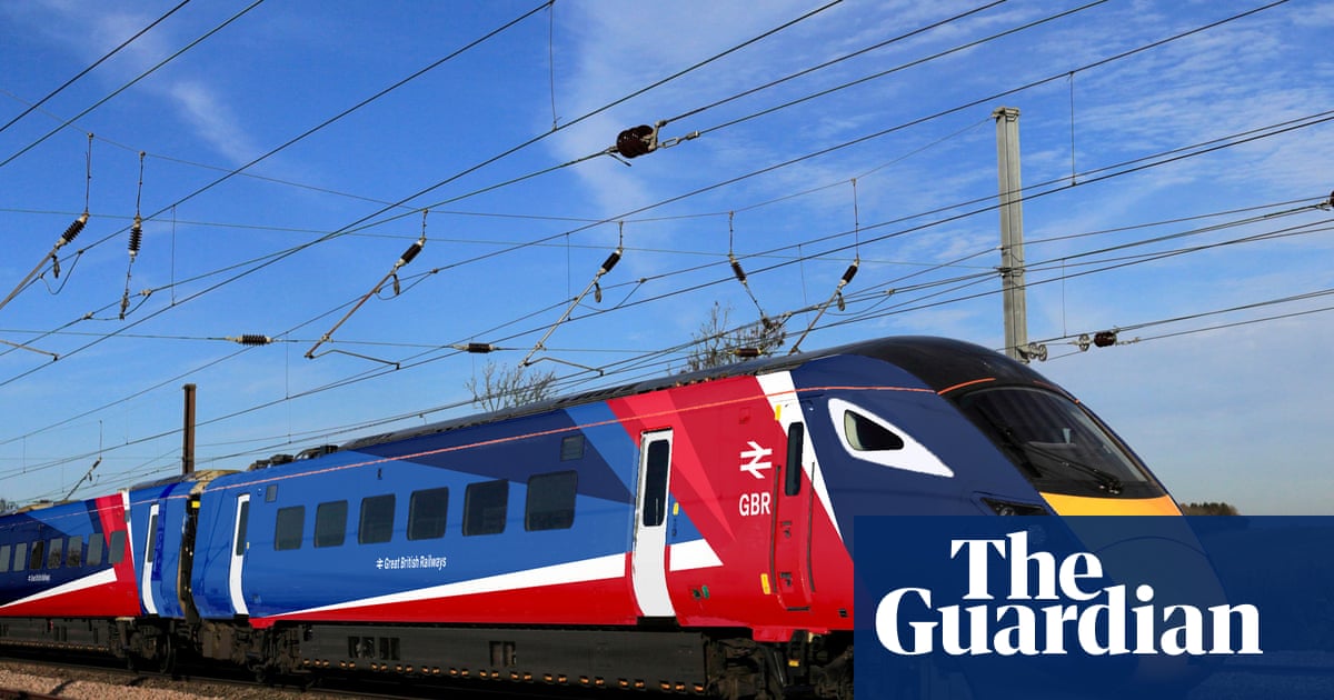
With all of the pride of them doing it "in house" and not using a design consultancy, it shows.

The livery is questionable as to if it meets the NTSNs for colour contrast for doorways, using a train sim to show it off rather than proper renders in something like 3DS MAX... I could go on.

But it very much smacks of amateur hour in livery design, rather than something that's been properly considered.

Also, with this much in varying large panel colours, there's no way this can be a 'majority paint' livery like some of the best out there, this will all be applied with vinyl's so a much more wasteful application of resources. Rather than some of the much better national liveries and private liveries that are formed of a primary paint base, with applied trim single colour vinals (ie. not printed).

EDIT: Looked some more into the images, it probably does meet the NTSN, but the livery just doesn't flow well around the doorways at the leading ends because of the breaks needed in the diagonal car lines.
 
Sponsor Post - registered members do not see these adverts; click here to register, or click here to log in
R

RailUK Forums

jupiter

Member
Joined
9 May 2021
Messages
339
Location
Dorset
I think it looks slightly better on the squared off front. My mother would have referred to it as a ‘dog’s dinner’.
 

generalnerd

Member
Joined
20 Jan 2025
Messages
455
Location
Hull
I agree, the real issue is the design not the base colours.

A return to rail blue with some grey (or ecru) and crimson accents would have worked well (not least for hiding dirt).
Absolutely, even adjusting the glue (and adding a striped along the carriage) would improve the livery 10x
 

Sir Felix Pole

Established Member
Joined
21 Oct 2012
Messages
2,190
Location
Wilmslow
I'm all for nationalisation and the adoption of a strong, modern corporate livery just as BR did way back in 1964. This really is amateur hour, however, and a hideous mess just to save a few pennies. Hopefully it will go the same way as SNCF's horrid 'En Voyage' livery.
 

signed

Established Member
Joined
13 May 2024
Messages
2,386
Location
ROI
I am of the opinion that red and blue should never be on anything together since that makes anything hidious. It could have been much worse
 

generalnerd

Member
Joined
20 Jan 2025
Messages
455
Location
Hull
The designer of this horrible livery should be made to appear before a special committee to explain matters.

If a custodial sentence should be handed down, what time period do our thread contributors consider suitable punishment?
1 northern rail delay
 

stuu

Established Member
Joined
2 Sep 2011
Messages
3,770
The design is fine, the application is appalling. Have the flag based design on the front/rear and then carry the stripes along the carriages. Repeating on every carriage is terrible
 

AlterEgo

Verified Rep - Wingin' It! Paul Lucas
Joined
30 Dec 2008
Messages
29,532
Location
LBK
Article on the guardian:


For me, it’s fine, but not amazing. Nice to at least some colour added into a stock design, considering how much grey there has been recently. Coaches seem a bit much though.
Pretty much my thoughts. The end vehicles can be fussy but intermediate ones are probably better off plain or with a red and white stripe.
 

Jan Mayen

Established Member
Joined
30 Sep 2020
Messages
1,360
Location
Sussex
Anyone know if the branding is on show at a major station on Southern? I'll go and have a look if it is.
 

StephenHunter

Established Member
Joined
22 Jul 2017
Messages
2,928
Location
London
The design is fine, the application is appalling. Have the flag based design on the front/rear and then carry the stripes along the carriages. Repeating on every carriage is terrible
How does it work for a three-car DMU?

== Doublepost prevention - post automatically merged: ==

Anyone know if the branding is on show at a major station on Southern? I'll go and have a look if it is.
London Bridge today.
 

vicbury

Member
Joined
17 Mar 2012
Messages
1,052
Location
Lydney
With all of the pride of them doing it "in house" and not using a design consultancy, it shows.

The livery is questionable as to if it meets the NTSNs for colour contrast for doorways, using a train sim to show it off rather than proper renders in something like 3DS MAX... I could go on.

But it very much smacks of amateur hour in livery design, rather than something that's been properly considered.

Also, with this much in varying large panel colours, there's no way this can be a 'majority paint' livery like some of the best out there, this will all be applied with vinyl's so a much more wasteful application of resources. Rather than some of the much better national liveries and private liveries that are formed of a primary paint base, with applied trim single colour vinals (ie. not printed).

EDIT: Looked some more into the images, it probably does meet the NTSN, but the livery just doesn't flow well around the doorways at the leading ends because of the breaks needed in the diagonal car lines.
Yes, I could not upvote this higher if I tried. Graphic design and branding is extremely specialist work. It's not just the pain on the trains, it's the logo, the typeface, the colour palette, the tone of language, poster design, web and app design etc. It's actually the sort of highly skilled work that should be outsourced to experts in their field.

What we've ended up with looks so laughably amateur, garish, and incoherent. It's as if the brief was "make it more British" and everything else went out of the window.

It's embarrassing. I can't think of any other state operator in Europe that had rolled out something so bad in the name of so-called patriotism.
 

Warrior2852

Member
Joined
27 Oct 2018
Messages
318
Ignoring the debate about whether or not Union Jack colours should be used, the design itself beyond the colours just looks chaotic in a not great way. The sharp angles on the IET's curved bodyshell look jarring, it looks like someone made a 2D design file without accounting for how it looks wrapped around a 3D train. The bit at the front where the red stripe has its corner honestly looks like it was accidentally misaligned and spilt into the next section, because it awkwardly changes the angle of the downward line that the white stripe had started.

(Also I can't imagine Lumo are happy that the base paint colour is their exact shade of blue).

I really wish that we could keep regional liveries to give a bit of variety and local identity. Also, particularly with intercity vs local trains, having different designs makes it easier for the public to tell the difference between e.g. fast and slow trains at a glance, losing that would be unfortunate I feel.
 
Last edited:
Joined
9 Dec 2023
Messages
588
Location
High Wycombe
It’s alright IMO. It’s a bit full on, but like with the Chiltern Mk5 livery, I’ll warm up to it. Surely there were people who didn’t like BR blue when that first came out?

Also could just be me, but part of me feels that considering the recent uses and messaging behind the UJ flag that now might not be the best time to put this out…
 

Goldfish62

Veteran Member
Joined
14 Feb 2010
Messages
13,209
I’m quite surprised it’s so soon to be honest, I’d have thought they’d have waited for GBR to actually exist!
Quite. The actual organisation should be designing its livery(s), not civil servants!

The livery looks absolutely awful - designed by committee.
 

generalnerd

Member
Joined
20 Jan 2025
Messages
455
Location
Hull
Fair play to the Government for not wasting oodles of taxpayers cash employing a design firm.
I mean, if I can knock this design up in 2 minutes then anyone is a design consultant.
This has got a bit of everything for everybody :lol: :D
This is better tin my opinion, it has flow like the LNER livery and it took you two minutes
 

The exile

Established Member
Joined
31 Mar 2010
Messages
9,438
Location
Somerset
So offended then, it looks modern and not stuck in the past
No - “offensive” and “bad” are two very different concepts. Although it is unlikely that anyone could view something as offensive but not bad - the other way round is perfectly possible.
 

talldave

Established Member
Joined
24 Jan 2013
Messages
2,687
Call me grumpy but I really don't care what colour the train is, I just want it to run on time. But I guess I'm meant to feel positive that millions of our money is going to be wasted repainting trains?

Writing this whilst sitting at Clapham Junction wasting another 15 minutes of life because they couldn't run the train on time. It's the same, day in, day out, week after week.
 

physics34

Established Member
Joined
1 Dec 2013
Messages
4,093
Yuk.
I wonder how much it's going to cost to
repaint everything?
The leasing companies must be rubbing their hands together.
Which leads me on to another thought...
Has anyone actually seen anything regarding how much the introduction of GBR and nationalisation is actually going to cost?
If they are clever enough it will be done gradually as and when its needed. With several classes of stock a regular paint job or wrap is needed to prevent erosion.
Signage will cost a bit... might just be vinyl stickers too though.

== Doublepost prevention - post automatically merged: ==

Rather puzzled at those complaining of the use of Union flag colours. Only in the UK would anyone have a problem with their own country's flag. Other countries use them without comment,
EXactly. Sadly shows the intolerance of some of the left wing.
Does look like GB news though lol
 

dosxuk

Established Member
Joined
2 Jan 2011
Messages
2,440
In view of all these negative comments, I think they should go back to the drawing board.
If getting negative comments from the enthusiast community is all it would take to reject a design, we would never get a new one approved.

Is it perfect - no. Is it the best design ever applied to a train - no. Is it the worst design ever applied to a train - also no. Should it be a surprise to anyone based on current Government design styles - again, no.

It's also worth remembering that most liveries go through a period of adjustment after they are initially launched. For all the standardisation of BR Intercity - there were some significant differences over the stock and the years. It's hardly like this is going to the be the final design for ever more.
 

birchesgreen

Established Member
Joined
18 Aug 2015
Messages
7,675
Location
Solihull
Rather puzzled at those complaining of the use of Union flag colours. Only in the UK would anyone have a problem with their own country's flag. Other countries use them without comment,
I think a lot of folk are complaining about how its been applied.
 

signed

Established Member
Joined
13 May 2024
Messages
2,386
Location
ROI
Only in the UK would anyone have a problem with their own country's flag. Other countries use them without comment
Add France to that list, the French flag basically only gets out on right wing demonstrations and on major national sports team games, else it's taken as being a fascist. (but that's off-topic)
 

sor

Member
Joined
15 Nov 2013
Messages
795
I don't mind it (and I say this as someone who is very much not politically aligned with the groups that have overused the flag recently). I remember when SWT changed hands and people were lamenting the loss of the stagecoach era livery, but this feels like a return to that. That said, the screenshots of the app do very much look like that "news" channel.

The livery has been posted in other (non rail) places I frequent and it is interesting to see that the response is much more positive. Same sentiment as others in regards to toning down the middle carriages.
 
Status
Not open for further replies.

Top