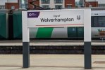
LOL The Irony
Established Member
I think it looks nice and adds some pizazz to the sign. I suppose you think the Network Rail station circles look ridiculous?It looks ridiculous with the cropped double-arrow.

I think it looks nice and adds some pizazz to the sign. I suppose you think the Network Rail station circles look ridiculous?It looks ridiculous with the cropped double-arrow.
Northen should split into 'Lancashire and Yorkshire' for the southern part and retain 'Northern' for the northern part.I personally do not think there should be a standard livery across the network on the grounds that regional identity would be lost. I would rather that operations were branded similar to how they are now, but with a few changes compared with the existing TOC areas as follows:
- Avanti merged with LNWR to form a GNWR brand.
- Cross Country merged with EMT to form a brand called Midland Connect.
- WMT (operationally separate from LNWR by this point) brand to be used additionally on XC services to Nottingham and Leicester (stopper only).
- Great Northern split, with the Moorgate services becoming part of the London Overground brand and the Kings Lynn route becoming part of the LNER brand.
- Chiltern Railways renamed as Chiltern & Oxbridge, with brand used on all planned EWR services in addition to those from London Marylebone.
- Northern and TPE split into separate Northwest and Northeast brands.
- All HS2 and NPR services to be branded as Intercity Express.
- All other brands (SE, Southern, Thameslink, SWR, GWR, TfW, Merseyrail, Overground, Crossrail, GA, c2c, Scotrail) remain as they are.

I think it looks nice and adds some pizazz to the sign. I suppose you think the Network Rail station circles look ridiculous?

Northern was, and continues to be, split into east and west side, so it makes sense to split them vertically. Horizontally would still result in the east west split.Northen should split into 'Lancashire and Yorkshire' for the southern part and retain 'Northern' for the northern part.
It does really work for me either, to be honest.
It makes the sign look more interesting, so why not have it?If a sign where nearly half the logo is cropped "works", all I can say is god help us all.
Pizazz, more like pfffttt!
When someone says pizazz, I think pizza, especially when someone also mentions circles. But it got me thinking about a sign that looks like one. A circle with little circles in with flags of each of the four nations, or even more if we include places like Cornwall.I think it looks nice and adds some pizazz to the sign. I suppose you think the Network Rail station circles look ridiculous?
Northern was, and continues to be, split into east and west side, so it makes sense to split them vertically. Horizontally would still result in the east west split.
It makes the sign look more interesting, so why not have it?
Because, like I said, it doesn't work. Either incorporate the whole thing or leave it out entirely.
It's already done that, so why not make it more interesting? Look at it like this, ASEA could've gotten away with putting square or rectangular bodyside windows on the loco in your profile picture, but made a stylistic choice to make them circular. I suppose you like the current black and white 1 minute in photoshop signs we currently have?It doesnt need to be more interesting. It needs to inform a passenger that this is indeed (and without doubt) the railway station at (in this case) Milton Keynes.
It's already done that, so why not make it more interesting? Look at it like this, ASEA could've gotten away with putting square or rectangular bodyside windows on the loco in your profile picture, but made a stylistic choice to make them circular. I suppose you like the current black and white 1 minute in photoshop signs we currently have?
It's been cropped, not daubed with names of former partners. Stop acting like it's cultural vandalism. If you want some actual cultural vandalism to shout at, look up the Mappin & Webb building in London.The unadulterated classic BR "double-arrow" has style by the bucket load. Cropping it as in the above is the style equivalent of Tracy Emin's bed.
Stop acting like it's cultural vandalism.
I wouldn't go as far as ridiculous, but it doesn't look right to me either. I really liked it at first glance (the faded blue colour really works) but then I noticed part of the double-arrow logo was missing and went right off it.It looks ridiculous with the cropped double-arrow.
You called a cropped logo adulterated, compared it to a piece of modern art and called me a 5 year old because I disagreed with you. Mate...Stop acting like a petulant 5 year-old.
Whatever, but you certainly are not my "mate".You called a cropped logo adulterated, compared it to a piece of modern art and called me a 5 year old because I disagreed with you. Mate...

Agreed. And it’s also on the bottom line under the station name. It doesn’t need to be there twice (arguably it doesn’t need to be there at all): the point of a station nameboard is to communicate quickly where you are. Extra elements detract from that requirement.The unadulterated classic BR "double-arrow" has style by the bucket load. Cropping it as in the above is the style equivalent of Tracy Emin's bed.

What an utter mess.this is a very good example of how it can work, credit to Dispatcher on the Stour on Twitter


If the GWR logo was replaced with the BR arrows, what’s wrong with a sign like the one in the photo?


I'd suggest if we want to add extra stuff to a railway station sign, the station code letters (KGX, LIV, MAN etc) would be a better choice.

Whilst those are all much better looking that the utterly bland stuff that is actually being deployed, let's not forget that readability and accessibility was a key factor in the design we did get - adding lots of additional symbols and smaller text is not going to help with that. The last options of the bottom two rows in the first picture are about as far as I think you'd want to push it, but I think that the first two options in those rows are fine
The navy one would work best for platform signage and put us in line with most other countries (in Europe, at least). Navy on white could be used for other applications, such as print media.

In conclusion, these are the options I've come up with.
View attachment 112861
== Doublepost prevention - post automatically merged: ==
View attachment 112862
(one of them with the station code)
Bottom right looks good to me. Features all the colours too.